Page 4 of 4 FirstFirst 1234
Results 61 to 80 of 80

Thread: Lesson 3 - Avatars & Signatures

  1. #61
    Willowran's Avatar Domesticus
    Join Date
    Nov 2010
    Location
    Canada
    Posts
    2,356

    Default Re: Lesson 3 - Avatars & signatures

    hmmm...i thought i had posted this here, but apparently not...


    In another (non-TWC-class related, but for history class) i am attempting to use GIMP to edit a map.

    Text worked fine to lable "italy", but when i go to lable the "Confederation of the rhine" the text does not show on the actual image... i checked he lable level, it is on top. checked opacity, txt colour... zip.

    any ideas what might be causing this?

  2. #62
    Lü Bu's Avatar "Mightyest Man Alive"
    Join Date
    May 2008
    Location
    Split,Croatia
    Posts
    5,332

    Default Re: Lesson 3 - Avatars & signatures

    when can we expect lession #4?
    Proud patron of Wlesmana
    Assyria Total War
    Check update thread for new HQ models
    My Workshop™


  3. #63
    Domesticus
    Artifex

    Join Date
    Jul 2009
    Location
    The north
    Posts
    2,411

    Default Re: Lesson 3 - Avatars & signatures

    Quote Originally Posted by Willowran
    yep, that was it. thanks, proffessor goofy.

    i also edited out the black line in the center eye created by the edge of the two background images

    single-pixel border:
    Good. It looks quite nice now.

    @The Norseman: Wow, that looks good. The logo fits the sig very well.

    @Påsan: One more time I can only see your first signature, did you certainly upload them?

    The one I can see is very good though. You seem to have had a nice vision, and the result is pretty nice-looking as well!

    @Gen. Chris: Nice stuff. I think the SS menu is made either by y2day or cedric37. I'm guessing it was ced. And oh, the sigs are good, too.

    @ForteS: Excellent work - I'm looking forward to your last piece.

    Quote Originally Posted by lolIsuck
    I'm kinda busy with uni right now but I will do it in the next days.
    Allright.

    @Bolkonsky: Very good, especially the second avatar and first signature. And yeah, avatars can be kept bigger if you want as they'll be automatically resized.

    Quote Originally Posted by Willowran
    hmmm...i thought i had posted this here, but apparently not...


    In another (non-TWC-class related, but for history class) i am attempting to use GIMP to edit a map.

    Text worked fine to lable "italy", but when i go to lable the "Confederation of the rhine" the text does not show on the actual image... i checked he lable level, it is on top. checked opacity, txt colour... zip.

    any ideas what might be causing this?
    I can't quite recognise the problem. Could you take a screenshot, upload it and send to me via PM?
    Quote Originally Posted by Lü Bu
    when can we expect lession #4?
    You'll have to wait no longer - I just posted it.

    Okay, only a couple of people are yet to complete this lesson - well done everyone!
    Last edited by Goofy; May 21, 2012 at 10:38 AM.

  4. #64
    SonofPeverel's Avatar GLORY TOTHE BROTHERHOOD
    Content Emeritus

    Join Date
    Oct 2009
    Location
    Texas
    Posts
    1,219

    Default Re: Lesson 3 - Avatars & signatures

    Originals


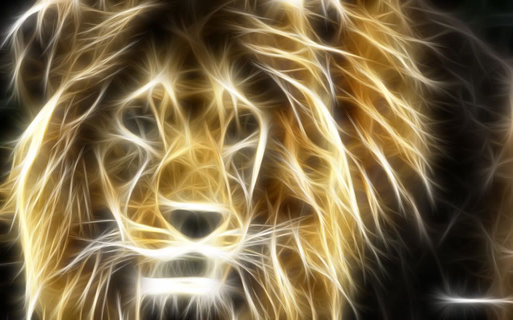
    Avatar 1


    Originals 2


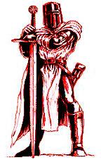
    Avatar 2


    Sigs
    Original


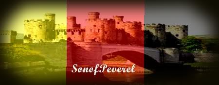
    Sig1


    Originals


    Sig2
    Last edited by SonofPeverel; May 25, 2012 at 12:19 AM.

    HOUSE OF HADER

  5. #65
    NobleNick's Avatar Artifex
    Join Date
    Feb 2006
    Location
    Huntsville, AL, USA
    Posts
    1,602

    Default Re: Lesson 3 - Avatars & signatures

    Avatars and sigs edited into post on page 2. Assignment complete.

  6. #66
    Domesticus
    Artifex

    Join Date
    Jul 2009
    Location
    The north
    Posts
    2,411

    Default Re: Lesson 3 - Avatars & signatures

    @SoP: Very good. The lion avatar looks interesting - perhaps you could make the lion more easily seen? The second avatar may look better if you made the knight either cyan, blue or gray, as well as a little bigger. Just my personal opinion, though.

    @NobleNick: Nice. As to the martians leg shadow, well, I honestly have no idea what might be causing that. Try again and pay attention to whether your Alpha selection is complete.

    @Påsan: Wow, the avatars are really nice. I like especially the first one. Your vision of the first sig is very good - too bad the signature and the shadows are cut off. You might find a way to tweak that, perhaps. But the result is really surprisingly good, although I'd like to find a solution to make the Skyrim logo and text a little bigger so it could be seen better. Now that alone gives your sig a little messy feeling of some kind. Anyways, it's great. The second one is nicely edited as well. Also, the Norway sig is very nice, because it's so clear and simple - adding a little more visible border may still improve it, though.

  7. #67
    SonofPeverel's Avatar GLORY TOTHE BROTHERHOOD
    Content Emeritus

    Join Date
    Oct 2009
    Location
    Texas
    Posts
    1,219

    Default Re: Lesson 3 - Avatars & signatures

    Quote Originally Posted by Goofy View Post
    @SoP: Very good. The lion avatar looks interesting - perhaps you could make the lion more easily seen? The second avatar may look better if you made the knight either cyan, blue or gray, as well as a little bigger. Just my personal opinion, though.
    OK, I will work on that and repost them Sigs are coming today...I couldn't get one the way I want it.

    HOUSE OF HADER

  8. #68
    Shankbot de Bodemloze's Avatar From the Writers Study!
    Citizen

    Join Date
    Dec 2011
    Location
    Midlands, UK
    Posts
    14,834
    Blog Entries
    2

    Default Re: Lesson 3 - Avatars & signatures

    Sorry I'm late...

    Avatars
    Technique 1
    Spoiler for Original

    Spoiler for Edited

    Technique 2
    Spoiler for Original

    Spoiler for Edited


    Signatures
    Technique 1
    Spoiler for Original


    Spoiler for Edited

    Technique 2
    Spoiler for Original

    Spoiler for Edited
    Last edited by Shankbot de Bodemloze; May 22, 2012 at 03:34 PM.
    THE WRITERS' STUDY | THE TRIBUNAL | THE CURIA | GUIDE FOR NEW MEMBERS


    PROUD PATRON OF JUNAIDI83, VETERAAN & CAILLAGH
    UNDER THE PATRONAGE OF MEGA TORTAS DE BODEMLOZE

  9. #69
    Squid's Avatar Opifex
    Patrician Artifex Technical Staff

    Join Date
    Feb 2007
    Location
    Frozen waste lands of the north
    Posts
    17,760
    Blog Entries
    3

    Default Re: Lesson 3 - Avatars & signatures

    Apologies for the lateness. I'll also have lesson 4 tomorrow or the day after hopefully.

    Spoiler for avatar 1


    Spoiler for avatar 2


    Spoiler for signature 1


    Spoiler for signature 2
    Under the patronage of Roman_Man#3, Patron of Ishan
    Click for my tools and tutorials
    "Two things are infinite: the universe and human stupidity; and I'm not sure about the universe." -----Albert Einstein

  10. #70
    Domesticus
    Artifex

    Join Date
    Jul 2009
    Location
    The north
    Posts
    2,411

    Default Re: Lesson 3 - Avatars & signatures

    Quote Originally Posted by SonofPeverel
    OK, I will work on that and repost them Sigs are coming today...I couldn't get one the way I want it.
    I'd suggest hurrying up...

    @Shankbot12: Excellent work! I like both of the signatures, and the avatars are very good as well. The text is good - it's sharp but not too dominant. And don't worry, the schedule is a bit tight right now. Just make sure you don't get too much behind.

    @Squid: Never mind - good that you could post them even at this point.

    The work is quite top-notch again. Adding a very thing shadow to the second avatar may be a good idea, but not necessary. The gradient on the first avatar is a nice choice. As it comes to the sigs, especially the first one looks very good - it's sharp and the colours are very good. The composition of the second sig is fine in my opinion, but I might rework the text in the top left corner. Making it partially transparent might improve it - I'm not sure, but you could try if you want. Also you could try making the red shadow a little more saturated.

    I'm having my exam week now as well as during next week so you'll most likely have a lot more time for Lesson 4 than I was first thinking. It states in the OP that you should post the homework by this evening but I haven't been able to prepare Lesson 5 yet, so, it may be that Lesson 4 will end on Tuesday or something. We'll see then.

    I should update the "Lesson passed" list of this and the fourth lesson but I don't have the time right now.

    Excellent work everyone, I'm just hoping that some people (at least SoP) would post their homework very soon.
    Last edited by Goofy; May 25, 2012 at 07:12 AM.

  11. #71
    SonofPeverel's Avatar GLORY TOTHE BROTHERHOOD
    Content Emeritus

    Join Date
    Oct 2009
    Location
    Texas
    Posts
    1,219

    Default Re: Lesson 3 - Avatars & signatures

    Quote Originally Posted by Goofy View Post
    I'd suggest hurrying up...

    .
    Sorry, Mr. Teacher. They are posted now.

    HOUSE OF HADER

  12. #72
    Domesticus
    Artifex

    Join Date
    Jul 2009
    Location
    The north
    Posts
    2,411

    Default Re: Lesson 3 - Avatars & signatures

    @SoP: Good job. They're rather good, although personally I'd apply a layer mask with a gradient on the flag in the first sig - so that it would slide nicely to transparency. Anyways, good work.

    Some people are still to post the homework. I'll contact them immediately.

    @megalitho: Oh, I just noticed your work. What can I say... Brilliant. Especially the last signature looks somewhat professional-made!

    Remember to inform me when you update your post - either via PM, VM or a regular post in the relevant thread.
    Last edited by Goofy; May 25, 2012 at 07:30 AM.

  13. #73
    Squid's Avatar Opifex
    Patrician Artifex Technical Staff

    Join Date
    Feb 2007
    Location
    Frozen waste lands of the north
    Posts
    17,760
    Blog Entries
    3

    Default Re: Lesson 3 - Avatars & signatures

    Quote Originally Posted by Goofy View Post
    @Squid: Never mind - good that you could post them even at this point.

    The work is quite top-notch again. Adding a very thing shadow to the second avatar may be a good idea, but not necessary. The gradient on the first avatar is a nice choice. As it comes to the sigs, especially the first one looks very good - it's sharp and the colours are very good. The composition of the second sig is fine in my opinion, but I might rework the text in the top left corner. Making it partially transparent might improve it - I'm not sure, but you could try if you want. Also you could try making the red shadow a little more saturated.
    There is a drop shadow on the second avatar though come to think of it I may have made it backwards, so that its a drop shadow of the transparency instead of the person. Thanks about the gradient on the first avatar, I was trying to get the diretion of the gradient to match the direction of the shadows in the image. As for the second sig, how would I increase the saturation of the red shadow of the text?
    Under the patronage of Roman_Man#3, Patron of Ishan
    Click for my tools and tutorials
    "Two things are infinite: the universe and human stupidity; and I'm not sure about the universe." -----Albert Einstein

  14. #74
    Domesticus
    Artifex

    Join Date
    Jul 2009
    Location
    The north
    Posts
    2,411

    Default Re: Lesson 3 - Avatars & signatures

    Quote Originally Posted by Squid
    There is a drop shadow on the second avatar though come to think of it I may have made it backwards, so that its a drop shadow of the transparency instead of the person.
    A drop shadow is always added for a selection, so it doesn't matter whatever you have selected as far as the shadow looks good - and this is your case. It is where it has to be.
    Quote Originally Posted by Squid
    As for the second sig, how would I increase the saturation of the red shadow of the text?
    The way I did with the "Napoleon" signature - open the "Colors" menu and then select "Hue-Saturation". Make sure you have selected the "Master" mode and then move the "Saturation" slider to right.

    However, it is also possible that your text is already as saturated as possible. In that case you should try either using the "Colorize" function or the "Colorify" function (again, both of these are under "Colors") to redefine the colour of the shadow. If you go for "Colorize" you'll probably have to play a little with the "Lightness" and "Saturation" values to get the result you want (you should set the Hue to 0).

    Duplicating the shadow layer and setting the layer mode to Normal, Overlay, Color or something may work, too. Just try and you'll get the desired effect.

    As I said, reducing the opacity (maybe to 50-75 %?) of "the reapers are here" might be a good idea as well - so the text would be somewhat dark gray. The red shadow may turn out too bold if you do this, however, so you may have to reduce it's opacity a little as well. See what you like the best and go for it.
    Last edited by Goofy; May 25, 2012 at 12:29 PM.

  15. #75

    Default Re: Lesson 3 - Avatars & signatures

    Sorry for delay. I'll check the 4th lesson latter today.


    UNDER THE MOST HONORABLE PATRONAGE OF: Legio!
    PATRON OF: Wangrin, ♔Sir Digby Chicken Caesar♔, Geronimo2006 and Narf!

  16. #76
    Beorn's Avatar Praepositus
    Join Date
    Jan 2009
    Location
    Athens
    Posts
    5,327

    Default Re: Lesson 3 - Avatars & signatures

    Αvies:

    originals
    Spoiler Alert, click show to read: 


    edited
    Spoiler Alert, click show to read: 


    sigs to be finished soon

  17. #77
    lolIsuck's Avatar WE HAVE NO CAKE!
    Patrician Citizen took an arrow to the knee

    Join Date
    Dec 2010
    Location
    Heerlen, Limburg
    Posts
    13,693

    Default Re: Lesson 3 - Avatars & signatures

    Jeeeuj, I'm the last one.

    Done the avatars, not exactly proud of them but very useful lesson if I want to make one in the future.

    EDITED AVATARS!!!!


  18. #78
    Domesticus
    Artifex

    Join Date
    Jul 2009
    Location
    The north
    Posts
    2,411

    Default Re: Lesson 3 - Avatars & signatures

    Please finish the signatures soon so you can move on to the next lesson. You're not the only ones who are late, though - I've extended the Lesson 4 homework handing date to Monday because not many students have completed the lesson.
    Last edited by Goofy; May 26, 2012 at 04:06 PM.

  19. #79
    Beorn's Avatar Praepositus
    Join Date
    Jan 2009
    Location
    Athens
    Posts
    5,327

    Default Re: Lesson 3 - Avatars & signatures

    Finally the sigs (1st one is almost bad )
    Spoiler Alert, click show to read: 

    Spoiler Alert, click show to read: 

  20. #80
    Domesticus
    Artifex

    Join Date
    Jul 2009
    Location
    The north
    Posts
    2,411

    Default Re: Lesson 3 - Avatars & Signatures

    It seems that I forgot to comment some of these - I'm waiting for lolIsuck to post his homework and have thus saved the comments for Beorn to comment their work at the same time, but I didn't realise that I never said a word of the stuff above my latest post. That's partly due to my hurry preparing Lesson 5 and teaching Lesson 4, though.

    @ForteS: Great, I like the sig. However I'd suggest to remove the white text at the bottom right corner.

    @Beorn: Very good - the first avatar is rather cool. The effect on the first sig is a bit weird indeed, but the second one is a lot better. Although I'd edit the background screenshot a little - now it doesn't look very personal.

    @lolIsuck: Good. The second one is quite nice. Now just do the rest of the stuff and complete Lesson 4 as well, dammit!

Page 4 of 4 FirstFirst 1234

Posting Permissions

  • You may not post new threads
  • You may not post replies
  • You may not post attachments
  • You may not edit your posts
  •