
Originally Posted by
nicolasete

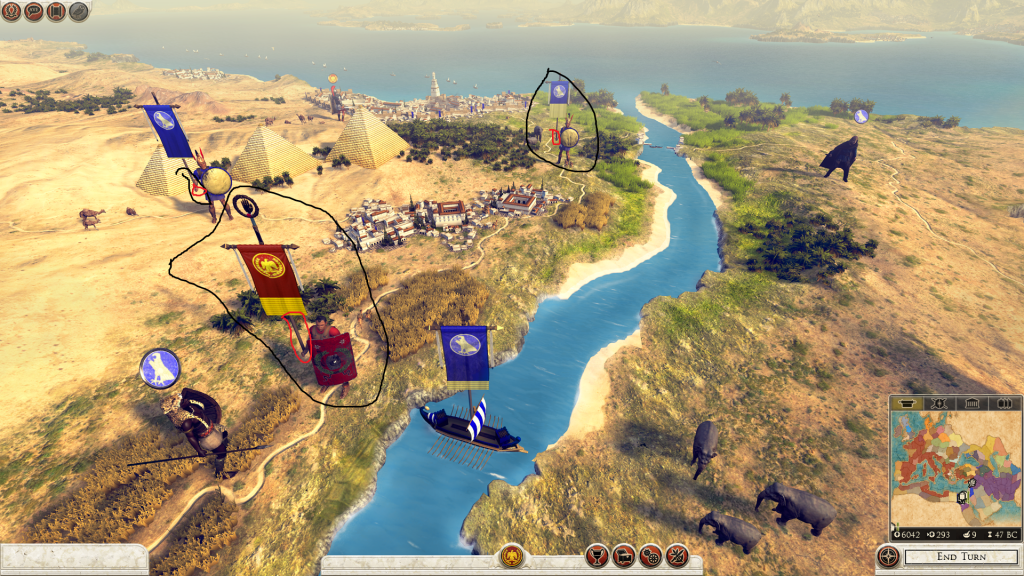
This is one of the first things i actually noticed when i saw this screenshots.
They look weird to me too, i don't know if it is the shield+banner choice (banner+weapon looked better),or the stance itself (maybe it is just that the "stick" is too short and feels physically disproportionate (it should reach the ground at leats).
In the other hand, this is probably not the angle in which the game is designed to be played, so maybe it looks better from the usual more isometric view (aka from above). Most top-down games tend to exagerate proportions, sizes and animations in order to look right from above.


 Reply With Quote
 Total War is the only massive war game that has yet to be Surpassed keep up the good work CA don't let us down!!!!


")


