Yeah, I prefer that one quite a bit myself.
TWC won't let me give you anymore rep at the moment.


Yeah, I prefer that one quite a bit myself.
TWC won't let me give you anymore rep at the moment.

Fantastic work, the DaC faction icons really needed an update. But please leave the Enedwaith icon as it is. I think it looks incredible! I like this strange, weird vibe - it is somehow fitting to Enedwaith. I don't like this faction really, but I would consider starting a campaign, only because of this icon


")


")
Thanks and LoL for the Enedwaith, well, I should consider running a poll then
More seriously, I have another idea for Enedwaith that might please everyone (me included, because TBH the current icon does not please me 100% either, as did the ancient one).
Patronized by y2day/Patron of KDK, Swagger & Navajo Joe, of the Imperial House of Hader
I can see your ponit on Gundabad, and yea this one is much better for Enedwaith.
What do you think about this symbol for Rohan?.
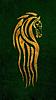
Not fond of this, I prefer the white horse
For Enedwaith, here is a 3rd option (probably the best):

Patronized by y2day/Patron of KDK, Swagger & Navajo Joe, of the Imperial House of Hader
I'd say that's perfect. With Enedwaith being so poorly fleshed out in the lore I think something "vague" like that is absolutely fine. Whereas with the Pukel man, I think it just stood out as too different from the rest of the images.
Great work man, I think it's a shame the DAC team didn't want these in the mod, but at least you're releasing it as a sub mod.
I agree on this third one.
@El Monstero: I understand these icons were too much 'modern looking' for the team and I did not respect their iconology choice, so I fully respect their choice
....
Ok so preview with tuned Enedwaith and added Dark Lord Icon.

Patronized by y2day/Patron of KDK, Swagger & Navajo Joe, of the Imperial House of Hader
I very much approve! I think what I like the most about these images is that they remind me of a graphic novel. Like if LotR had been turned into a giant comic book these are the kinds of images you would see.
Thanks that is exactly the effect I was looking for and I'm glad that you share my view
By the way some of them were drawn by Tolkien himself
Patronized by y2day/Patron of KDK, Swagger & Navajo Joe, of the Imperial House of Hader
Holy crap, these look awesome! :-O
You know, there's something about the Rohan icon that's making me fall crazily in love with it.
Are these officially in DaC in next or later patches or are you making a submod?
It will be a submod as the team rejected the design.
Patronized by y2day/Patron of KDK, Swagger & Navajo Joe, of the Imperial House of Hader

Too bad, your icons look stunning. One little note from my side: The Rohan horse is too static in my opinion. It should be more like... a warhorse, not a draft horse. Just two more lore details: Morgoth's true name was not Melkior, but Melkor. Oh, and Moria is referred to without an article.
I like the originality of the concept for the Galadhrim, which reminds the ring of Galadriel, but it should both shows more a ring and more vegetation. Yes it's not easy, I don't really know how to make it better. For now I don't prefer it, but that's a very nice 'start'.
Last edited by Vifarc; January 21, 2019 at 05:19 PM.
> > Divide&Conquer submod user, playing RealmOfLothlõrien (ThirdAge mod). < <
My small products here.
Dunlands Icon looks weird maybe a Norse of Celtic design would fit it better.
These all look incredible Cedric! I'm honestly surprised the dev team rejected your designs, since your icons are of superior quality to the original ones, but that isn't a problem since we can enjoy this with any version of the game.
A critiques of mine however:
-Dunland should have a Celtic/Norse eagle design, as mentioned by Taurion above.
-The Ar-Adunaim icon should have dark red inside instead of a burgundy/wine color.
-The Galadrim design should be gold and light green perhaps.
-Woodland Realm's symbol should be more of a pure, forest-like green.
-Dol Amroth's design could use a slightly deeper blue.
---Unit Modelers and battle map creators wanted!--- Discord: https://discord.gg/7qwdgr4
Thanks for the quality feedback, I've adjusted icons here and there, so now here is the latest version:

Last edited by cedric37; January 22, 2019 at 03:54 AM. Reason: adjusted some more icons
Patronized by y2day/Patron of KDK, Swagger & Navajo Joe, of the Imperial House of Hader
The Craban of Dunland flying high. Nice!
 Posting Permissions

 Reply With Quote


