After 3 days with it I don't agree with you at all, it's a different setting and I'm fine with it now, can't understand how others are not......it for the most part ain't changing back guys so best get used to it


After 3 days with it I don't agree with you at all, it's a different setting and I'm fine with it now, can't understand how others are not......it for the most part ain't changing back guys so best get used to it

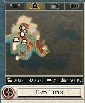
Agree. I think that part of the reason many people are thinking that the game was dumbed down is because the UI let us with that feeling. The tech tree in Shogun 2, for example, was a single page with all techs available, it was impressive and the player new that he had to choose the way e make a build. In Rome 2 it is divided in several small boxes and, because you can't see the hole, you start thinking that it has less techs and the game has been dumbed down.
Double layer unit cards and unit numbers on cards are indeed there . In fact numbers on cards i mentioned twice
That annoyed me too, I started using quick-save shortcuts instead, Ctrl-S (quick-save), Ctrl-L (quick-load). Agree with everything in the first post, how the hell did this UI make it into the game, its uninformative and unintuitive. The Shogun 2 UI was far superior. On the diplomacy screen they need to get rid of the stupid 3d avatars and put in large faction icons and faction names, pretty much like they had in Shogun 2 on the top left/right of the diplomacy UI. Accidentally made a non-aggression pact with someone I was about to go to war with because I thought I'd changed to another faction.Originally Posted by Eien

UI was designed for use of a controller. Makes sense if you think about it.

One scary possibility for the crappy UI could be that they made this game with next gen consoles in mind. There are several things that makes me believe that CA is planning to bring this out on consoles, starting that the sound files are in the xbox format.
As a software developer and someone who own Shogun 2 ,I believe that Rome 2 is based on a Pre Shogun 2 (Directx 9) version of the warscape engine.The UI seems to have been designed before that of shogun 2.The engine looks and performs worse than shogun 2. I'm guessing only a few directx 11 features (Depth of field) that were in shogun 2 have made it to to Rome 2. The rest don't work like they did in shogun 2. The give away for me is - in shogun 2 all the shader model options had a vastly different look from each other (3 , 4 , 4.1 and 5) , in rome 2 they are identical (i suspect the setting doesn't do anything) . To me rome 2 looks like dx9 shogun 2 with only depth of field being added on. Also tesselation is gone in rome 2.
Last edited by FinkPloyd; September 06, 2013 at 09:54 AM.
Siven, Thank you for this thread. I've been whining about this for some time here since R2 was released. The interface is uninformative and also very very dull and boring. I find it very hard to really get into the campaign, it's just not exciting. What CA needs to do is give their fans/customers a big "Thank you for being patient patch" and fix the interface, give us more turns per year, weather/seasons for the campaign map, ect. Just for the thread to catch fire and show those who are in charge of this game we are not joking around and not to be bullied with. I dare those to post images of the interface of Napoleon - Total War, Empire - Total War, Medieval 2 - Total War just for comparison.
Last edited by ShadowMassa; September 06, 2013 at 09:59 AM.
Jesus that's sad , what a terrible downgrade,specially the settlement details and the diplomacy screen.
I agree with you, the graphics seem a step back. Its reeking more and more of a console port. The spartanic and clunky ui, the super speedy battles, less than impressive and jagged graphics etc... hallmarks of a console port. Hopefully they aren't using us PC gamers as beta testers just to bring out a improved console version on Christmas.
In terms of campaign UI I prefer the city UI in Rome 2. I like how you can see exactly what's affecting your population and even tells you if the region is stable and in how many turns the region will rebel if it isn't stable. In terms of technology UI it's simply different, and I prefer the diplomacy UI in Rome 2. I don't like the character UI in Rome 2 though. It makes the characters seem a lot less interesting.
However in terms of battle UI, I prefer everything in Shogun 2. I also liked the simply button that moved your army forward or with hotkey " ' " but it seems like you can't do that in Rome 2.
my guess is just CA thinks the strategy map view of Rome 2 is too awsome to be covered with any big pop windows and whoever buy the game will prefer staring into such awsome view to smart informative agent/tech details
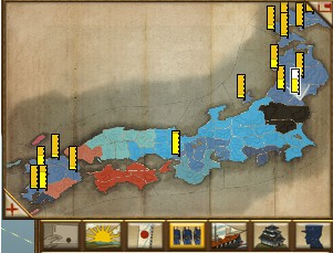
Agreed, especially regarding the character skill trees. There seems to be no information for the army tradition skill tree at all, not even in the encyclopedia..I do like the new diplomacy panel, but like you I wish it showed who was trading with who. It seems that the only way to find this out is to manually find the trade routes that go to each capital..Another problem I have is with how cluttered the army/navy/agent icons are on the map. I'm not sure what the green bar beside each icon is supposed to represent - it always seems to be full regardless of the army size or the movement points it has left. Whatever it is, it really should be removed. Instead, any information the bar is supposed to convey should be put inside the icon..Compare to the Shogun 2 map, which displays the size of each army. In addition, clicking on these icons will automatically select the army it corresponds to, rather than simply moving to the general area, as it does in Rome 2.
Rome 2's UI for exchanging units between two generals is bad. If you have a full stack of troops on one general, the unit cards are so squeezed together it's difficult to select the ones you want. In a full stack, I had 12 levy spearmen and I wanted to pass 4 of the least experienced spearmen to the other general. However, the unit cards are so squeezed together I can't tell which are the ones I want to move to the other general.
The intereface is indeed atrocious. One little thing I find particularly annoying is the use of vague iconography for EVERYTHING. Half the time I'm approached in diplomacy, or I'm attacked, I have no -idea- who the other faction is. It's insane.
The only thing I like about it are the various new overlays (strategic view) that present a lot of information quite handily. Everything else is a massive step backward. In fact, I would say Rome II's interface isn't simply worse than Shogun 2's--it's the worst UI Creative Assembly has ever released.
"What is the most cowardly and shameful thing in human conduct? It's when people with power, and those who flatter them, hide in safe places and extol war--people who force patriotism and self-sacrifice on others, sending them to the battlefield to die. For the sake of peace in the universe, before we continue this fruitless war... mustn't we first start by exterminating such evil parasites?"
-Yang Wen-Li

I also like the diplomacy screen, just wish it showed more info without me having to mouse over the stupid face icon when I select a faction on the diplomacy map.
everything else OP has written is spot on! stupid research tree is 6 panels!!! 6!!! geeeeez.
fear is helluva drugSpoiler Alert, click show to read:Spoiler Alert, click show to read:
OP is completely right on everything, I really can't believe that CA thought this interface would work
Just bring back minimize UI in battle. What they have now is NOT minimize UI.
Couldn't agree with you more.
At first I thought it was simply because of wasn't used to the new interface, but no. It is worse in so many ways, terrible use of screen space, menus 3 levels deep when only single screen would be required to show all the information, oversized unit cards that bizarrely show less information than the smaller unit cards of shogun 2.
This is typical CA "fixing" what isn't broken and ending up with something altogether worse.
 Posting Permissions

 Reply With Quote