")
")


")
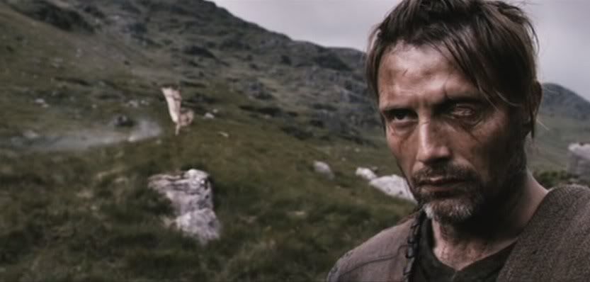
Original 1
Spoiler Alert, click show to read:
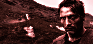
My Avatar 1
Spoiler Alert, click show to read:
Original 2 (from previous lesson)
Spoiler Alert, click show to read:
My Avatar 2
Spoiler Alert, click show to read:
Original 3
Spoiler Alert, click show to read:
My Signature 1
Spoiler Alert, click show to read:
Original 4
Spoiler Alert, click show to read:
My Signature 2
Spoiler Alert, click show to read:


 Reply With Quote

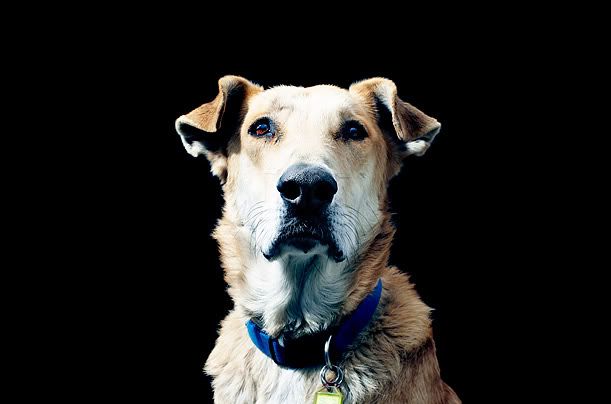
 only the one that looks like it...
 ). To do that, however, I guess you have to decrease the image size a little as well.


")


")


")


")
")
")
")
")
")


")


")
 .
.
")
")
")