")
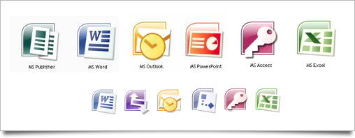
After more than 18 years using the same iconic style for the office suit Microsoft has decided to change them altogether following the path of Adobe.
The new icons will consist of a uppercase version of the first letter from the program name.
An W for Word, a P for PowerPoint.
This is more or less a straight copy from Adobes CS3/CS4 suit's Ps for Photoshop, ID for Indesign etc. etc.
What the designer at Redmond seems to forget is colour-blind persons that will have to struggle when they are to open PowerPoint.
Microsoft Project 2010, PowerPoint and Publisher all uses the uppercase P for it's icon.
Microsofts responded when asked why this change;
"The new icon designs respond to research that informs us that users can more easily associate icons by letter and color than by abstract design.
Weve adopted an alphabet system to bring a more uniform approach to the wide variety of Office family products.
I let you decide whenever these new icons are an improvement, meanwhile I keep sticking to apple's iWork suit.
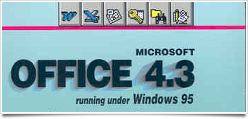
Office 4.3
Office 95
97
Office for Mac 2004 and 2008
Office 2007


 Reply With Quote
")


")
")


")
")

")

")


")