Page 1 of 4 1234 LastLast
Results 1 to 20 of 73

Thread: GIMP Basics Final Exam

  1. #1

    Default GIMP Basics Final Exam

    Final Exam
    Hey guys,

    after several lessons the time is ripe for the final exam now! It has been a pleasure to work with you but now you have to show me what you've learned!

    The exam consists of two parts, the first one being closely related to lesson 3 while the second one is more about creativity. Part A will deal with making an animated signature whereas part B will feature creating a wallpaper. But anyway, let's begin.


    __________________________________________________________________________________________


    Part A - an animated signature

    The GIMP can be used to create animated signatures. Creating the animation itself isn't that difficult but the problem is keeping it within the 250 KB limit for signatures. Therefore, I will focus on a very basic animation which will not exceed that limit. If you want to create an animated banner or wallpaper, you can of course use a more advanced animation.

    First of all you have to decide on a theme for your signature. Keep in mind that not all signatures are suited for animations. Generally, quotations work well but feel free to experiment a bit.

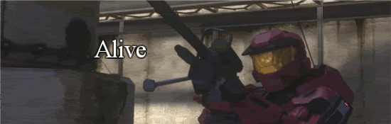
    Remember to create a layer for every image which shall become a frame of your animation later on. In this example, I have chosen two rather basic images (of Anakin Skywalker/Darth Vader) and each of them has its own layer. Feel free to use more than two layers, though. Make sure that the lowermost layer is the one which you want to appear first on your signature whereas the uppermost one shall appear last. Here I put the Anakin layer below the Darth Vader layer:

    Spoiler Alert, click show to read: 


    The next step is deciding on how long each image should appear before the signature switches to the next one. Simply double-click on the layers' names and put a number in parentheses behind the names. For example: Layer 1 (1000ms).

    I went for 1500 milliseconds (ms) for both images so each of them will appear for 1.5 seconds. Feel free to use a different number, though.

    Spoiler Alert, click show to read: 


    Our next goal is reducing the size of the whole animation a bit. Simply go to Filters -> Animation and select "Optimize for GIF". The quality of the images will be reduced a bit as a result which is especially useful when you want to use many images in a single signature.

    Spoiler Alert, click show to read: 


    Now we want to test our little animation. In order to do that, go to Filters -> Animation again and select "Playback" this time. A new window will pop up in which you can test your animation.

    Spoiler Alert, click show to read: 


    If you're happy with the result you should save your signature now. Make sure to save it as a .gif file. A new window will pop up and you must select "Save as Animation" as shown below. Once you have clicked "Export", a second window will appear but it's not necessary to change any of its options.

    Spoiler Alert, click show to read: 


    Now all you have to do is upload your signature at the image hosting website of your choice and you're finished. Your result should now look similar to this:


    __________________________________________________________________________________________


    Part B - creating a wallpaper


    As I've already mentioned above, now comes the creative part. And that means that there won't be a strict step-by-step tutorial. You have already learned most of the important techniques so all you have to do is to apply them. Recently, I've created the following wallpaper for a graphics competition:

    Spoiler Alert, click show to read: 


    I've created this image by utilizing many relatively basic features of the GIMP - and by experimenting. I believe you're able to create something similar as long as you are creative and try new things. In general, there are several important things to keep in mind if you want to create a banner or wallpaper:


    • Use layer masks! That way, blending is so much easier and you can add cut out images without problems.
    • The eraser tool is your friend. When using a lower opacity and the fuzzy brush, it can for example help with removing hard edges and the likes.
    • Remember to utilize the layer options. "Overlay" and "multiply" are especially interesting.
    • The Gaussian Blur is a very powerful feature. It can for example be used for adding shadows behind objects but also for creating dust or smoke.
    • Play around with the color curves, the "Brightness/Contrast" menu and the saturation. Pictures often look much more epic if you make them darker and increase the contrast.
    • Duplicate your layer, colorize the duplicate and lower its opacity a bit. Sometimes, e.g. a red or blue touch improves images considerably.
    • Remember that text is a powerful tool. Make it visible but not too dominant. Keep in mind that adding a shadow behind a text (via Grow -> Bucket Fill -> Gaussian Blur, see lesson 1) can make it much better visible.
    • Use brushes. There are thousands of amazing brushes and they can really improve your images. Generally, put them on a separate layer so you can edit them, blur them or lower their opacity without changing the rest of the image.


    Finally, here are a few small tutorials which can be very useful when creating a wallpaper. First of all, here's a tutorial for creating golden text.


    Golden Text

    Step 1

    To begin with, simple open a new image consisting of a white background. Then go to <image> --> Renders --> Clouds --> Difference Clouds.

    Spoiler Alert, click show to read: 

    A new window will pop up where you can select several different things. Choose something like 3.0 for both X and Y. "Details" can stay at 1. Also select "turbulence". The window should now look like this:

    Spoiler Alert, click show to read: 


    Press Ok and the effect will be applied to your white background. Your image should now look something like this:

    Spoiler Alert, click show to read: 


    __________________________________________________________________________________________________


    Step 2

    In order to optimize the result, increase the image's contrast. Either go to <image> --> Colors --> Brightness/Contrast and do it manually or go to <image> --> Colors --> Automatic --> Stretch Contrast. Anyway, your image should now look similar to this:

    Spoiler Alert, click show to read: 


    __________________________________________________________________________________________________


    Step 3

    Now we want to change the image's color to gold. In order to do that, select "Golden" in the gradient section of the GIMP tool kit:

    Spoiler Alert, click show to read: 

    Afterwards, select your image and go to <image> --> Colors --> Map --> Gradient Map:

    Spoiler Alert, click show to read: 

    Now, the gradient will be applied to your image. In order to improve it a bit, go to <image> --> Filters --> Blur --> Gaussian Blur, set it to 10 for both horizontal and vertical and apply it to your image. The result should look similar to this:

    Spoiler Alert, click show to read: 

    Also, go to <image> --> Colors --> Brightness/Contrast and make it a bit darker and with more contrast (so it actually looks golden).


    __________________________________________________________________________________________________


    Step 4

    In order to create the actual text, simply choose a font and text size and put your text roughly in the middle of the golden background. Select the text layer and choose "Select from Alphachannel". Then go to the golden background layer and press ctrl-c (copy) and ctrl-v (paste). Now, your golden text will appear. Delete the old golden background layer and the original text layer so only the golden text remains.


    __________________________________________________________________________________________________


    Step 5

    Now there is one last thing we need to do. Go to <image> --> Filters --> Maps --> Bump-Map:

    Spoiler Alert, click show to read: 

    A new window will pop up where you can decide what the Bump-Map should be like. Choose settings similar to the ones below or experiment with them if you wish:
    Spoiler Alert, click show to read: 

    Press OK and the Bump-Map will be applied to your text. And you're done! You have created a great golden text which should look similar to the one below. Feel free to add an outline, shadows or anything else.


    (I originally posted this tutorial here)


    __________________________________________________________________________________________________


    Alternatively, you can also save your finished gold texture as a .pat file in Gimp 2.0 -> share -> gimp -> 2.0 -> patterns. That way, all you have to do is select a text's alpha channel and fill it with the gold pattern. The tutorial can also be used to create a metal/steel texture which can then be used as a pattern as well. Here's a dark metal texture I created, feel free to use it:

    Spoiler Alert, click show to read: 


    Creating such textures is actually relatively easy:

    1. Go to Filters -> Render -> Clouds -> Difference Clouds and use that as a base. Apply a Gaussian Blur with a radius of around 50-100 afterwards.
    2. Create several new layers and experiment with grunge brushes using shades of gray and black. Play around with their opacity as well and apply a Gaussian Blur to some of them.
    3. Merge all layers and duplicate the remaining one. Mirror it vertically or horizontally, lower the opacity and set it to "Overlay" for example.
    4. Finally, change brightness and contrast to improve it even further.


    The next tutorial is about a feature which can look pretty good on wallpapers and banners. It's of course entirely optional, though.

    Curling
    This is a rather straightforward tutorial for GIMP which attempts to teach you how to achieve a page curl effect.


    Step 1:

    Open up Gimp and create an image, signature or wallpaper of your choice. Also decide on your foreground/background colors as they are responsible for the color on the back of the page (if you choose that option later on, that is).


    Step 2:

    Go to <image> --> Filters --> Noise and select "Curl" (this is from my German version of GIMP but that shouldn't be a problem):

    Spoiler Alert, click show to read: 


    Step 3:

    A new window should pop up. Here you can decide in which corner of the page the curl should be put, you can select your desired opacity and choose the colors (in this case, background/foreground colors are selected):

    Spoiler Alert, click show to read: 


    Once you have decided on the details, simply press "ok" and the curl effect will be applied to your image. And you're done! The final result should look similar to this:

    Spoiler Alert, click show to read: 


    While this is a rather short and simple tutorial, I hope that it'll be useful for you anyway.

    (I originally posted this tutorial here)


    This third and last small tutorial will teach you how to create rain. Just as the other two tutorials it is of course optional but is supposed to give you some inspiration and additional ideas.

    Creating Rain

    In this short tutorial I'll explain how to create rain with GIMP which can for example be used for editing screenshots from Total War games and the likes.

    Step 1


    Open up your image, then create a second black layer on top of the background one:

    Spoiler Alert, click show to read: 


    Afterwards, go to Filters -> Render -> Clouds -> Difference Clouds.

    Spoiler Alert, click show to read: 


    A new window will pop up in which you can change several settings. Remember, the more "dots" you use, the heavier your rain will become.

    Spoiler Alert, click show to read: 


    Then go to Layer -> Transparency -> Color to Alpha and select black. Black will now become transparent and only the white dots will remain.

    Step 2

    Now go to Filters -> Blur -> Motion Blur and set the length to something between 100-200. The angle is up to you and depends on where you want the rain to come from.

    Spoiler Alert, click show to read: 


    You'll notice that the rain is basically invisible now so you have to duplicate its layer several times (around 8-12 times) and merge down the layers afterwards. If you think that the rain is too heavy and uniform, you might want to take the eraser tool with an opacity of around 20-30% and a fuzzy brush and erase parts of the rain to make it look more realistic. Eventually, I'd also darken the whole image a bit. Here is what I came up with (credit for the original screenshot goes to tone and the RS II team):

    Spoiler Alert, click show to read: 


    But there's also another way to create rain. Skip the first few steps of this tutorial and use a fuzzy brush for a few small white dots on a new layer instead. Try to vary the size of the dots a little by using different brush sizes. Afterwards, apply a motion blur as explained above. You can combine the two different methods of creating rain or stay with one of them if you wish.

    Creating snow is very similar, simply use a larger white fuzzy brush for the dots and use a shorter length (of about 5-10 at most) when motion blurring.


    And with that this lesson comes to an end. You should now be able to create your own banners or wallpapers by applying what you've learned in this lesson and the three previous ones. It has been a pleasure to teach you guys and I'm confident that you'll be able to complete this final exam successfully.

    Cheers,
    Astaroth


    Homework
    In order to pass this exam and to complete the GIMP Basics class, there are two things you have to do.

    1. Create an animated signature. Utilize what you have learned in this lesson and the other ones to create a beautiful animated signature consisting of several frames. Show me what you've learned and try to use as many techniques as possible (e.g. use brushes, text, reflections, a signature border etc). The maximum size is 550x175 pixels but your signature can of course be smaller than that if you wish. Keep in mind that it musn't exceed 250 KB, though.
    2. Create a wallpaper or banner. You may use a theme of your choice and can for example create a banner for a modification or game if you wish. Try to utilize the techniques which you've learned by now - e.g. blending, shadows, work with your text etc - and impress me! There is no real size limit for this task but your wallpaper should be at least around 800x800 pixels.

    Please also give me a short summary of what you've done and list the techniques which you have used! If you need help or have any other questions, comments or complaints, don't be afraid to ask. Good luck!

    The deadline for this exam is Tuesday in a week, the 9th of June. I might extend it a bit if necessary, though.
    Last edited by Astaroth; June 04, 2009 at 04:16 AM.

  2. #2

    Default Re: GIMP Basics Final Exam

    Great job Astaroth !

    here's part A :

    Spoiler Alert, click show to read: 


    Again , LOTR stuff 
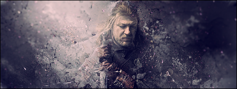
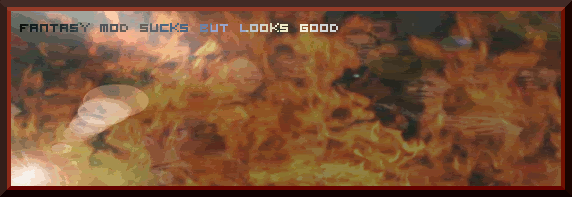
I haven't done much nice stuff , will do that later .. Maybe adding some more frames And making the text LOTR-Style

    Anyway , great stuff Astaroth , will update my homework tomorrow ..

    Part 2 : Golden text :

    Without white background :

    Spoiler Alert, click show to read: 


    With white background

    Spoiler Alert, click show to read: 
    Last edited by Killerbee; June 03, 2009 at 01:31 PM.

  3. #3

    Default Re: GIMP Basics Final Exam

    Glad you like it. The animation is cool and funny but please also make an animated signature (550x175 pixels maximum) if possible.

  4. #4

    Default Re: GIMP Basics Final Exam

    Here is a very very simple animation
    more detailed work soon


    EDIT it seems not to be showing up here is a link instead

    http://s712.photobucket.com/albums/w...nt=project.gif


    EDIT 2


    here is a better animation sig(i did not feel like adding the text of his speach but if you want i could )
    Last edited by sithlord447; June 02, 2009 at 05:45 PM.

  5. #5
    Lü Bu's Avatar "Mightyest Man Alive"
    Join Date
    May 2008
    Location
    Split,Croatia
    Posts
    5,332

    Default Re: GIMP Basics Final Exam

    Animation:
    Spoiler Alert, click show to read: 


    Creating rain /funny I make tutorial about this in Graphic workshop/:
    Original:
    Spoiler Alert, click show to read: 


    Edited:
    Spoiler Alert, click show to read: 


    Golden text:
    Spoiler Alert, click show to read: 


    Wallpaper/banner:
    Spoiler Alert, click show to read: 


    Tehniques:Bsicly same sa you Astaroth!

    Darn it I just read that i only need to do wallpaper or banner and animation!
    Last edited by Lü Bu; June 03, 2009 at 01:50 PM.
    Proud patron of Wlesmana
    Assyria Total War
    Check update thread for new HQ models
    My Workshop™


  6. #6

    Default Re: GIMP Basics Final Exam

    Part A


    Part B

    Spoiler Alert, click show to read: 

    Rainy Times


    Last edited by Tzar; June 07, 2009 at 05:03 PM.
    The House of Wilpuri ~ Proud Patron of: The Noble Lord & Sumskilz


  7. #7
    PubliusKhannus's Avatar Senator
    Join Date
    Mar 2009
    Location
    Austin Texas
    Posts
    1,208

    Default Re: GIMP Basics Final Exam

    Easy stuff first:

    Animation:
    Spoiler Alert, click show to read: 

    Rain:
    Spoiler Alert, click show to read: 


    Golden Text:
    Spoiler Alert, click show to read: 


    Part B :
    Spoiler Alert, click show to read: 

    Check out my collection of poetry, prose, & comedy @ https://badwriter.net

  8. #8

    Default Re: GIMP Basics Final Exam

    Good job guys.

    Publius, for the rain you might want to duplicate the rain's layer another few times and to use an eraser to erase the white spots near the top of the image.

    karlost, maybe use a bigger wallpaper size. Currently, it's a bit hard to recognize anything. I've increased the minimum size to 800x800 pixels now, 600x600 is too small I think.

  9. #9

    Default Re: GIMP Basics Final Exam

    Ok, Here is an animation.
    Last edited by Ratbag; June 04, 2009 at 01:13 PM.
    | "I don't suffer from insanity, I enjoy every minute of it." |

    My Workshop |The Graphics Workshop| Critic's Quill |Imperium Graecorum

  10. #10
    Lü Bu's Avatar "Mightyest Man Alive"
    Join Date
    May 2008
    Location
    Split,Croatia
    Posts
    5,332

    Default Re: GIMP Basics Final Exam

    Quote Originally Posted by Astaroth View Post
    karlost, maybe use a bigger wallpaper size. Currently, it's a bit hard to recognize anything. I've increased the minimum size to 800x800 pixels now, 600x600 is too small I think.
    Ok,sure!I just kep myself in borders you give us!
    Proud patron of Wlesmana
    Assyria Total War
    Check update thread for new HQ models
    My Workshop™


  11. #11

    Default Re: GIMP Basics Final Exam

    I'm only giving a minimum size, you can of course make a bigger wallpaper if you wish.

    Good job, Ratbag.

  12. #12
    Lü Bu's Avatar "Mightyest Man Alive"
    Join Date
    May 2008
    Location
    Split,Croatia
    Posts
    5,332

    Default Re: GIMP Basics Final Exam

    I was thinking this is max size
    Proud patron of Wlesmana
    Assyria Total War
    Check update thread for new HQ models
    My Workshop™


  13. #13
    Roloc's Avatar Biarchus
    Join Date
    Dec 2008
    Location
    San José, Costa Rica
    Posts
    652

    Default Re: GIMP Basics Final Exam

    Here is my animated sig:

    Spoiler Alert, click show to read: 


    Here is my wallpaper:

    Deutschland über alles!!!!!

    Spoiler Alert, click show to read: 


  14. #14

    Default Re: GIMP Basics Final Exam

    My Animated Sig.
    Spoiler for Previous Work


    And my wallpaper. Sorry that's it this big, but my sister wanted to use it as a background.
    Spoiler Alert, click show to read: 
    | "I don't suffer from insanity, I enjoy every minute of it." |

    My Workshop |The Graphics Workshop| Critic's Quill |Imperium Graecorum

  15. #15

    Default Re: GIMP Basics Final Exam

    I finished my Wallpaper and you can see it in post #6
    The House of Wilpuri ~ Proud Patron of: The Noble Lord & Sumskilz


  16. #16

    Default Re: GIMP Basics Final Exam

    My animation:
    Spoiler for animation

    All those images used in it were made by me.(that is why they look so horrible.) Most of those images are rather simple. For the pillar one that is in it, I selected the middle of the image and filled it with red. That is what I got, so I dunno.

    My wall paper:
    Spoiler for wall paper

    If it is too big, let me know.

    Here are the original images:
    Spoiler for original images


  17. #17
    Eöl's Avatar Divide and Conquer
    Artifex

    Join Date
    Jan 2009
    Location
    The kingdom of the Netherlands
    Posts
    1,835

    Default Re: GIMP Basics Final Exam

    My animation: http://www.twcenter.net/forums/album...ictureid=18112

    My wallpaper comes later

    Under the patronage of Pøntifex Maximus

  18. #18

    Default Re: GIMP Basics Final Exam

    here is my wallpaper


    Spoiler Alert, click show to read: 

  19. #19
    PubliusKhannus's Avatar Senator
    Join Date
    Mar 2009
    Location
    Austin Texas
    Posts
    1,208

    Default Re: GIMP Basics Final Exam

    Try not making it so this side that side, overlay one side onto another, perhaps merging the flags in the middle, allowing to flow more freely. But that's just my opinion.

    Check out my collection of poetry, prose, & comedy @ https://badwriter.net

  20. #20

    Default Re: GIMP Basics Final Exam

    This place reserve for me!!
    For this i use the signature bar technique and some overlay, borders, Blend tool and some other small stuff , like brush deletion lightning filter.
    First attempt:

    Spoiler Alert, click show to read: 

    Spoiler Alert, click show to read: 


    EDITED
    And this is a blend of just about everything you taught us as you can see i hope this is enough, size suppose to be 1024x764 i believe that is enough for a wallpaper.
    Wallpaper
    Spoiler Alert, click show to read: 


    Sorry but is not saving at the right size , it gets smaller after saving it.
    Here is a link to it. Image size is 1244px928px.
    Final test Wallpaper
    Last edited by Icedie El Guaraní; June 09, 2009 at 05:23 PM.
    Contribuitor IBIICB-WOTN-Modeler-Scripter


Page 1 of 4 1234 LastLast

Posting Permissions

  • You may not post new threads
  • You may not post replies
  • You may not post attachments
  • You may not edit your posts
  •