Not bad. However, I would suggest removing the flag's white background layer in your first signature. In the second one, you should also add a border and play around with brushes, brightness and contrast a little more. Furthermore, both signatures exceed the size limit of 550x175 pixels so you should fix that as well.
Originally Posted by Roloc
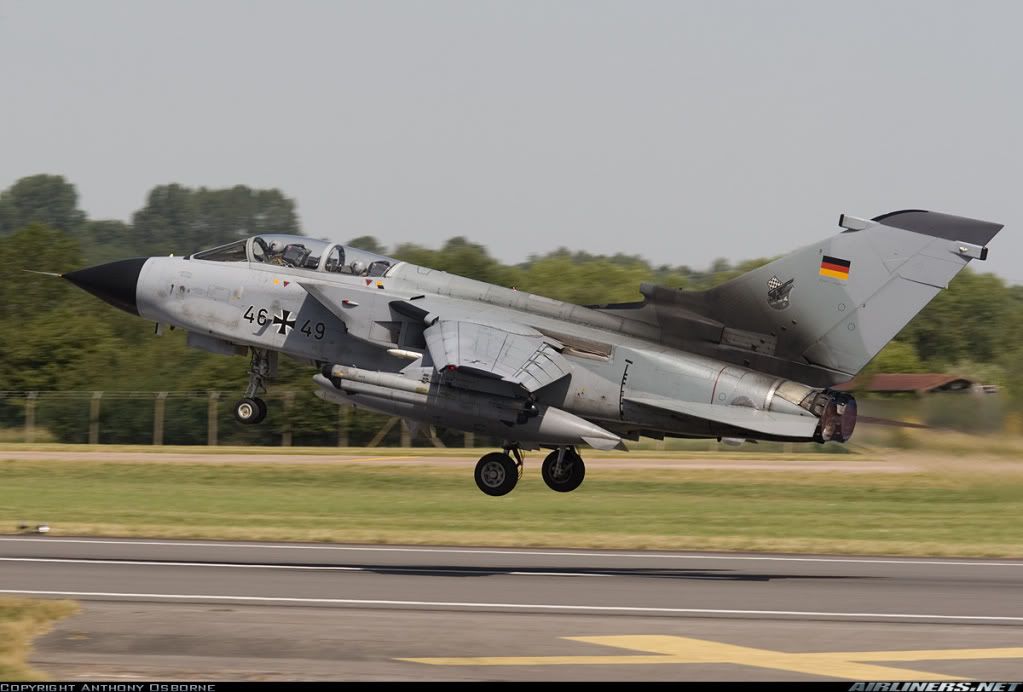
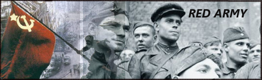
Here are all pics
Spoiler Alert, click show to read:
here is my work
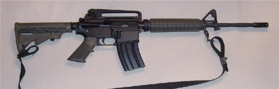
here is another pic
Spoiler Alert, click show to read:
here is my work
Nice signatures, although I would suggest working a bit more with both of them. Add some brush work to both and make the German flag blend in better by erasing the 'line' on its left. Do that with an eraser with an opacity of around 50-60% or less. The second signature could use a shadow but remember to apply a rather strong Gaussian blur to it and to lower its opacity to around 30-50% at most.
It would also help if you did more with different color layers and contrast, curves and brightness.
Originally Posted by Ratbag
Made 2 so far.
Spoiler for Picture's used:
Spoiler for Pic1:
Spoiler for Pic 2:
Spoiler for Picture's used:
EDIT: Karlost, could you spoiler those bigger pictures?
Good job. However, I would suggest using better pictures for your first signature because especially the eye is a bit hard to recognize. The second signature is a bit too red for my taste and you might want to lower the color layer's opacity a bit.
Originally Posted by Nevada
Ok, so there we go:
Original Pics:
Spoiler Alert, click show to read:
Signature:
Original Pic:
Spoiler Alert, click show to read:
Signature:
I think the text might be a bit bland (try to experiment with it, for example by filling the text with a pattern and blurring it. Be creative!) and the dark 'stripe' which you used as a border here is a little too strong still. I'd suggest turning down its opacity and blurring it further. Generally, the two pictures you used aren't really perfect as well so you might want to darken them to increase their quality.
The second signature isn't bad but you should really lower the red layer's opacity. Furthermore, I'd remove the white background layer before saving the signature.
Originally Posted by dragonsign
Quite good. The text could use an improvement however (how about adding a reflection and adding a white glow around it?) and you could make the signature more 'epic' by darkening it and increasing the contrast.
@Everyone: please remember to describe in short what you did with your signature. You should also keep in mind that you do not have to follow this tutorial to the letter. The effects and techniques you use should fit to the image and while e.g. grunge signatures might look good with a fuzzy border (see part B of this tutorial), others will not. You do not strictly have to use a red duplicated layer, either. Try other colors as well and lower the color layer's opacity so it enhances the picture instead of dominating it.
Art is a lot about experimenting so try out the different techniques you know by now instead of doing everything strictly as described here. Just play around with the GIMP's many features until you're happy with your result.
Last edited by Astaroth; May 18, 2009 at 07:41 AM.
I think the text might be a bit bland (try to experiment with it, for example by filling the text with a pattern and blurring it. Be creative!) and the dark 'stripe' which you used as a border here is a little too strong still. I'd suggest turning down its opacity and blurring it further. Generally, the two pictures you used aren't really perfect as well so you might want to darken them to increase their quality.
The second signature isn't bad but you should really lower the red layer's opacity. Furthermore, I'd remove the white background layer before saving the signature.
Thx for the criticism.
Just sad I don't have the working files anymore....
This one is an image taken yesterday from the new Viking museum in Iceland, and i think you wont find anything like it on the internet, its a scaled version of the settlement in Vinland( New FoundLand Canada)
Spoiler Alert, click show to read:
Last edited by Icedie El Guaraní; May 18, 2009 at 02:40 PM.
And the files that I used (All of the files I will be using in these signatures are in the public domain, GNU free documentation license, or Creative Commons):
Spoiler Alert, click show to read:
What I did was pretty straightforward. I blended the Swedish Naval Ensign in with the HMS Helsingborg, a Visby-class ship. Then, I simply darkened the border as described, for the most part, in lesson 1. I finally added in a simple text label and added a border to it.
Later in the week, I'll work more on the second signature. I hope to get a better one completed, but I am in the last two weeks of school, and I am very busy, so it may be of very low quality...


")
")
")


")


")
")
")


Originally Posted by Ratbag


")
")
")

")
")
 Posting Permissions