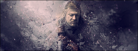
I don't understand this animation.. Why is there pink boxes in his pink 'swing' ?
As Fev said, the animation seems a bit laggy for me. Also the surroundings is a bit sharp.
Overall, pretty good


")


")
I don't understand this animation.. Why is there pink boxes in his pink 'swing' ?
As Fev said, the animation seems a bit laggy for me. Also the surroundings is a bit sharp.
Overall, pretty good

Cards, those "boxes" are cards


")


")
I made the animation quicker so there would be kind of a flash effect, shortly after I posted it I made the animation slower and the background more blurred in my file so I get what you are saying.Originally Posted by abbews

Are you not familiar with Gambit?

Last edited by Louis Lux; October 25, 2009 at 11:19 AM.

This as a backround.
This image blending into the backround with the human form the most clear
and the subtle placement of the words " Edged in Blue "
Also Ratbag, If you can, cut away the top black bit until it reaches colour.
Made some small changes to my submission:
And made the request above:

Much better mate!
Hi!
Your drawns looks very good!
Waiting for some more!
History lives here!
Thucydides, Herodotus, Polybius, Xenophon, Pliny, Livy, Plutarch, Strabo here they are the heros !
My Workshop
I have a bunch of drawings, perhaps I'll upload some of them later.
Made some changes to what I consider my best signature and submitted to the GC. Made some adjustments to Aragorn, especially the face, and the text, also made the rangers more visible in background.
This piece doesn't exactly fit my style but I would really like some feedback about the technique, I spend a lot of time in it but I'm not completely satisfied with it.Spoiler Alert, click show to read:Spoiler Alert, click show to read:
That you actually do that request
Well good luck with it!
And with your sig, it's abosuletely your best, but I still didn't notice the rangers!
")
")
I love your LOTR sig maybe one of ur bestanyway the rangers are really hard to see
About the decapitation for me the main problem is the blood..it isn't realistic: u should add more and make it more fluid...Maybe some motion blur can help too+rep and keep up the awesome work
i really like it,
Aragorn FTW!
I love your sub mate
TWC Son of the One and Only Abbews
I fear that if I make the ranger more noticeable it will take take the focus from Aragorn. Blood isn't really my thing, I just slapped the first thing I could find. I focused more in the blending and it was really tough. Abbews, I did it more for myself as a challenge, it's kind of fun to make scenes that you won't find anywhere, and these are the requests I prefer to do.
Ironically there is no real blending in these requests:

very nice, man...
-"None are more hopelessly enslaved than those who falsely believe they are free."Johann Wolfgang von Goethe---
Golden Conquistador
Text or no text? Make a border?

")
It's looking great LL. Text for me, but in my opinion not so bright, as it is now the main focus is in the text. Also, the L gun could be without the bottom part, it looks like a explosion from the bullet. Just a gun on vertical. And why not make Daniel Craig in colors? Like those other guys are history and Daniel is the present. On second thought i am not sure color will work...
Border... hmm, here it will only help for the half faces on the sides, but it's not really needed.
Anyway it's looking great, and believe me or not, when i came back home and looking at the subject for this week theme, i had the same idea with the legacy!
Great job my friend.

Same as maxi : Text, but darken it a little bit
Looking good, not great though. I agree with Maxi with the text. Good blending btw!
The gun is supposed to be also a 7. I could add color to craig's eye, what you guys think?

Last edited by Louis Lux; November 20, 2009 at 04:12 PM.
")
")

I think colour in Craigs eyes would look odd. The text looks better now, but i still think it needs to be more subtle
 Posting Permissions


 Reply With Quote