


")


")
")
Originally Posted by Lifthrasir
 Hmm. At first I thought it was just because that map is a lot larger than the other one, making the lines of the thumbnail harder to see (that is a part of it), but upon going back into the GIMP file and checking the colors and saturations, it is indeed a bit off. Thanks for the heads-up guys! I think it is because I was sick of clicking so many times to delete the color for each island or lake, leading me to just use color erase and go over everything with a huge brush, but I have just now found a much better way to go about things (will have to change the GIMP tutorial to reflect that). I think that this better method should also leave more darkness around things, making it easier to see the features of the land. If there is still an issue, I can always beef up the contrasts though.
Given the new method (and the state of the GIMP files I now have saved), I think I will have to start from scratch on the new maps. It should be a bit faster now that I know better how to go about erasing things, but there will still be some delay. I'll let y'all know when the new files have been uploaded though. In the meantime I'll leave the low-contrast ones up, in case anyone finds them sufficient (but know that better ones are coming). Thanks again for catching my mistake guys!


 Reply With Quote
")
")
 ) you can select the pencil, change it's mode to "color erase", and then just go over everything with it. If using this method it can be helpful to make the pencil have a hardness of 100 (prevents fuzzy edges to the erasure) and to make it have a huge size, reducing how much you need to swing it back and forth. Importantly, make sure you stroke across every inch of the canvas if using this method!!! Some colors will be components in other ones (erasing green can take a certain hue out of blue) and so erasing inconsistently will leave odd shadows that will be persistent later. ERASE EVERYTHING!


")
")
")
")
")


")


 After seeing that site and reading your guys' posts, I think I will need to do some mapping today! Oh, and would you (or anyone else reading this) be interested in seeing some hand-drawn maps I made a while back for a fantasy novel series I'm working on (it's on hold right now though, so don't expect to see any of the actual writing)? They're super detailed, with forests, mountains, rivers, swamps, etc., sort of modeled after the
 ")
")


 I basically just zoomed in and traced over the Magna Italica maps. (The coast lines, the mountains and rivers/lakes. All from those respective maps) The only thing I had to figure out was getting Google Earth maps to line up, which was tough because of the different projections that you said they use. But what's cool about what you've done is that it gives you an initial frame of reference that you can fit other stuff in. So all I had to do was use the free transform tool in photoshop and distort it until the Google map landform features matched the MI maps and I was good to go. It may not sound like a big deal until you actually go out there and google different maps and then try to make it all line up on your own. I would have been stumped doing this all on my own.
  Some text is a bit hard to read at the moment, something to keep in mind when thinking on a paperback page.
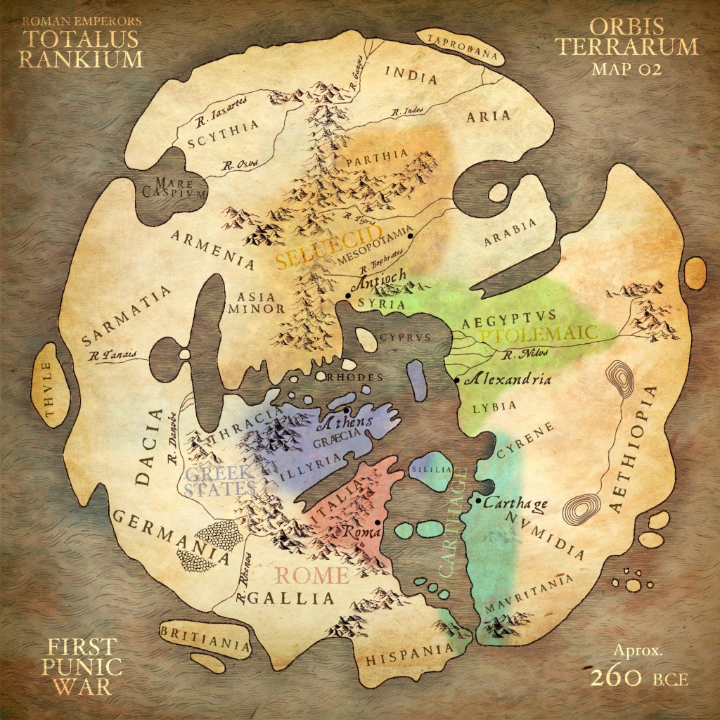


")
")


")


")
")


