Page 1 of 4 1234 LastLast
Results 1 to 20 of 80

Thread: Lesson 3 - Avatars & Signatures

  1. #1
    Domesticus
    Artifex

    Join Date
    Jul 2009
    Location
    The north
    Posts
    2,411

    Default Lesson 3 - Avatars & Signatures

    Lesson 3 - Avatars & Signatures
    Welcome to the third lesson, gentlemen! At this point we'll start the creative part of this course: on this lesson we'll study the basics of avatar-making as well as signature creating.

    Techniques
    • Image scaling
    • Using gradients
    • Adding a drop shadow
    • Drawing lines
    • Image cropping
    • Using layer masks
    • Using the Hue-Saturation function
    • Using the Stroke Selection feature
    • Using the Gaussian Blur
    • Using the Text Tool
    • Using the Desaturate tool
    • Using the Softglow filter
    • Using the Unsharp Mask filter
    • Using the Airbrush
    Avatars

    "Ordinary" avatar

    In this first part of Lesson 3 we'll create a simple "ordinary" avatar. With "ordinary" I'm referring to an avatar with no transparency - that is the most common type of avatars, although they don't usually contain renders unlike the one I'm creating here.

    Step 1

    First off I'll search a suitable render. This time I couldn't come up with anything better than this Ezio Auditore render:
    Click to view content: 

    Step 2

    Now, as the render is quite big, I'll rescale it to fit in a 100 x 100 pixels box - that's the maximum size of avatars we have here on TWC.
    Click to view content: 


    Step 3

    A good rule of thumb for this kind of avatar is that it should have a black one-pixel border. It's a very stylish decoration for almost any image, so you should really use it!

    I'll draw that border by hand - it could be done in some other ways too, but I just like this one. I'll create a new transparent layer, select the Pencil tool, set the scale to 0.01 (one pixel) and draw a line along the image borders by holding the Shift button down:
    Click to view content: 

    Step 4

    Now I'll use a gradient to create a stylish background.

    Gradients are very important to any 2D artist. The basic gradients with two colours can be used to fill the image or selection with a colour, but so that the colour isn't similar everywhere but it slides into another colour. There are also gradients with multiple colours, such like the spectrum gradients. In GIMP there's a selection of basic gradients, but you can also create your own by using the gradients with "FG to" in their name. To do that, just select your desired gradient as well as your Foreground and Background colours.

    I chose black and red, the gradient being "FG to BG". Now I'll create a new layer, put it to the bottom and fill it with my gradient by clicking with left mouse button, holding it down and moving it to another spot and then releasing it:
    Click to view content: 

    You may have to experiment a little with this to get the result you want.

    Step 5

    Now I'll select the Alpha of the render layer. In other words that means that I'll turn the outline of Ezio into a selection:
    Click to view content: 

    Step 6

    Now that I have selected Ezio I'll add a drop shadow around him by using the Drop Shadow filter. Make sure that the X and Y offsets are set to zero and that the "Allow resizing" box is unticked:
    Click to view content: 

    Step 7

    Finally I'll give Ezio the final touch by adding yellow with Color Balance:
    Click to view content: 

    And now the avatar is ready - and quite stylish if I say so myself!
    Click to view content: 

    Render avatar

    In this part of this lesson we'll create a render avatar which, as you can tell by its name, basically consists of only a render. Now we'll use the renders we made on Lesson 2 to create an avatar. You can also look for a render on web if you haven't a proper own one.

    As you remember, my render looked like this:
    Click to view content: 

    Step 1

    There's some unused space in the render image file, so I'll start out by cropping the image a little. To crop the image select the Crop Tool and (somewhat like with the Rectangle Select Tool) simply select the area you don't want to be cropped out. Once you're happy with your crop selection, left-click one of the squares in the corners of your crop area. You can also set the area to be cropped in the box for tool options and details at the bottom of the Toolbox.
    Click to view content: 

    You should leave a little empty space on the sides and above the render (or below if your render is complete unlike mine) because we will later add a shadow behind the render.

    Step 2

    Now I'll rescale the image just like with the "ordinary" avatar:
    Click to view content: 

    Step 3

    Once this is done you should select Alpha...
    Click to view content: 

    ...and add a drop shadow just like we did with the first avatar:
    Click to view content: 

    As you may now guess, the "Blur radius" factor stands for the size of the shadow. You could just as well use 10 as the value for this as we did in Part A of this lesson, but I went for 5 this time.

    The shadow can be added to make the avatar look better, add some depth to it as well as to hide the not-that-perfect parts of the render - because of this you sometimes have to add a white shadow if you have a very bright-edged render.

    Now the second (rather simple but fairly good-looking) avatar is ready as well!
    Click to view content: 


    Signatures
    For now we'll create two simple signatures by using several extremely useful techniques. Signatures can be only 550 x 175 of their size, so keep that in mind when you're looking for a good image to start off with. Also with signatures it's usually more important to add that (thin) border than it is with avatars. Without the border they'll usually look dull, except for signatures with a jagged edge. Those can be very pleasing to the eye, but we won't be studying making such an edge - all you need for that is a few grunge brushes and an idea of how to use them. Installing brushes and the basics of their use will be taught on Lesson 4.

    Signature 1

    First I'm going to create a simple NTW-based signature. Screenshots and other in-game content often make good material for signatures.

    Step 1

    First I'll naturally try to find appropriate images to build the signature from. This time I decided to go for a Napoleon: Total War screenshot of Napoleon, and a French flag.

    As the very first step I'll rescale the screenshot (once I've cut off the UI with the Crop Tool) to be 175 pixels high (it's now 450 pixels wide). Then I simply start working on it. I have also rescaled the French flag to a good, signature-fitting size. Now I'll put them on top of one another and on separate layers.

    Every time you paste a layer or object to your image it will first become a "floating selection". This means that you can't change your active layer and the floating layer won't be saved with the other layers if you choose to save the image. To make the floating layer normal you have to right-click on it in the Layer menu and select "Anchor Layer" (this will merge the layer with the previous active layer) or press Ctrl + Shift + N to create a new layer from the floating selection.

    Well, now I'll add a white layer mask to the flag layer by right-clicking the layer and selecting "Add Layer Mask":
    Click to view content: 

    The layer mask will be displayed as a black, white or black and white box next to your layer in the Layer menu (see the next screenshot). The colour of the layer mask represents the transparent areas of your layer - the areas that are white in your layer mask are non-transparent while the black areas are totally transparent. Gray areas are logically partially transparent.

    So, layer masks can be used to affect the layer's opacity. However, unlike the general layer opacity layer masks can be used to affect the opacity of certain parts of the layer and thus also making a great option for the Eraser Tool.

    Step 2

    Now that I have added a layer mask I want to blend the border of the flag and the screenshot. For that I'll have to use a gradient. I select the Blend Tool, make sure that my FG colour is black and BG colour white, the gradient is "FG to BG" and then blend by "drawing" a line from right to left. This is because black represents transparency in the layer mask and as you can see the gradient slides from black to white - that's why I have to start from the right so the black colour will be where the border of the flag and the screenshot is. Alternatively you could check the box "Reverse" that is next to the two-headed arrow next to the gradient (see the lower part of the Toolbox).
    Click to view content: 

    Step 3

    Now your flag should smoothly slide into the screenshot. You can now apply the layer mask - this hides the layer mask because it now becomes a part of the layer itself:
    Click to view content: 

    Step 4

    At this point I decided to tune the background layer a little. Now we'll increase its saturation with the Hue-Saturation feature and set it to 66 (basically anything between 50 and 100 is good - it's your signature in the end):
    Click to view content: 

    Step 5

    Now I want to darken the border area of my image. There are a couple of ways to do that, and I'll use perhaps the simplest one.

    First I'll create a new layer and press Ctrl + A to select the whole layer. This can also be done by right-clicking the image and selecting "Select" and then "All", but using the shortcut is a lot easier. Well, after that I'll draw a thick border by using the Stroke Selection function which is found under "Edit". Make sure that you have black as your foreground colour, as this feature uses the FG colour by default.
    Click to view content: 

    As you can see I have set the "Line width" value to 18. In reality I will have a border that is nine pixels wide - this is because the "Line width" indicates the total width of the line. As I had selected the whole image the other nine pixels were drawn outside of it.

    Step 6
    Now I select the Pencil tool (setting it to Fuzzy Brush may not be a bad idea) and try to smoothen the corners of the black area. As you can see the result is horrible, but as my intention was not to make an actual border (well, logically enough I named the new layer "Border") but a darker area instead I'm going to blur it, so the roughness won't matter at all.
    Click to view content: 

    Step 7

    Now we'll use one of the most powerful and useful GIMP features for the first time. That feature is the Gaussian Blur.

    To open the Gaussian Blur window click "Filters", "Blur" and then "Gaussian Blur". Then set the Blur Radius to whatever you want - I went for 60 pixels to make sure my "border" is smooth enough:
    Click to view content: 

    After this I duplicated the "border" layer (to make it look a bit bolder) and set the duplicated layer's opacity to 50 %.

    Step 8

    At this point I'd like to add some text to the signature - it is often a good way to improve the look of the sig as far as the text isn't too dominant. Signatures without text, on the other hand, can often be boring.

    To add text I'll select the Text Tool in the GIMP Toolbox. This tool is used exactly the same way as the Rectangle Select Tool, with the exception that you can make text with it of course. I want to add the text on the dark area at the bottom of my signature, so, I'll click and drag to create a text "box" there. Also my FG colour is white, because by default the text colour is your FG colour. Finally I'll set the font size to 15 (the ideal font size depends on the font: some are bigger, some are smaller) - all this can be done where the tool details and options are: at the lower part of the Toolbox.
    Click to view content: 

    As you can see, every time you use the Text Tool it will automatically create a new layer for the text. Thus you don't have to manually create a new one each time you add text.

    The font I'm using is Trajan Bold. You can download fonts for example on dafont and 1001 Free Fonts. To install a font simply download it and unpack the download file. Then right-click the unpacked font file (usually they're in .ttf - TrueType font file - format) and select "Install". Not only does this install it for your use on GIMP, but on other programs as well, such like Microsoft Office Word and Microsoft Office Excel.

    Step 9

    Now I'll select the Move tool and move the text "NAPOLEON" where I want it to be. To do this you must click on the image (make sure you have selected the text layer), hold the left mouse button down and move the image around by dragging.
    Click to view content: 

    Step 10

    The last step is quite simple while it is absolutely necessary to make the text look good. I'm now going to add a shadow behind it.

    First I right-click the text layer and select "Text to Selection". This is pretty much the same as "Alpha to Selection" but you can do it for (unedited) text layers only.
    Click to view content: 

    I could add the shadow by using the Drop Shadow filter, but I'm going to use the Stroke Selection instead to make the shadow a little bolder. Now that I have the text selected I'll create a new layer under the text layer and simply run "Stroke Selection":
    Click to view content: 

    Once you have done this you should blur the shadow/text border with the Gaussian Blur (with Blur Radius set to something around 3-5) to make the shadow smooth.

    Now the signature is basically ready - and it is quite a good one I think. I could've made it less saturated, though, as that is artistically a great alternative for high saturation.

    Finally - after some consideration - I decided to add a one-pixel black border, although this signature wouldn't necessarily need one because of the edge shadow.
    Click to view content: 

    Signature 2

    This time I'll go for something different. I decided to make a signature from a photo of Thierry Henry, well, just because he's ace.

    Step 1

    First I'll crop and resize the photo to signature size (in this case it was 398 x 175), duplicate the photo layer and set the new layer to Overlay mode (opacity still 100 %) and then create a one-pixel border on its own layer:
    Click to view content: 

    Step 2

    Now I'm going teach you a great colour trick I have discovered by myself.

    I'll select the lower (the original photo) layer and pick the Desaturate tool in the Toolbox. Using this tool is very simple: you just have to left-click the image and then choose Desaturation method. Here I have gone for lightness, but you can of course choose the one that best suits your image and vision.
    Click to view content: 

    This technique will give the colours a very stylish, a bit dusky look. This will be very useful for screenshot editing for example.

    Step 3

    To further boost the saturation trick I'm going to apply the Softglow filter on the desaturated layer. That will "simulate glow by making highlights intense and fuzzy". Select "Filters", "Artistic" and then "Softglow" and adjust the values as you want:
    Click to view content: 

    Step 4

    Now I'm going to sharpen the bottom layer a little. This can be done with the Unsharp Mask filter:
    Click to view content: 

    Step 6

    At this point I want to add some dramaticness to the signature by darkening the background a little, as well as weaken those bright spot lights out there. This can be done with the Airbrush tool for example. I'll select the Airbrush and set the details (at the bottom of the Toolbox) the way I want. I'll also create a new layer called "Brush" so if I go wrong with the brush it won't ruin the background layer.

    I'll start out with fading out the spotlight on the right:
    Click to view content: 

    After that I'll also cover some other parts with the brush as well (and darken the bright spot under Henry's right hand).

    Step 7

    Now we'll want to give our image the final touch - and this time that may just adding a little amount of magenta with Color Balance:
    Click to view content: 

    The second signature is now ready and actually pretty good-looking as well:
    Click to view content: 

    And after removing the annoying bright spot near the top left corner:
    Click to view content: 


    And we're done - the lesson number three ends here. The knowledge you have gained on this lesson will be the very foundation for anything you will learn in the future - many of these techniques aren't useful for signature- or avatar-making only, but practically for anything. Remember to keep practising: make signatures and avatars for yourself, for friends and for anyone, even for fun. You don't necessarily have to use them; sometimes it's awesome just to admire the results of your hard work.

    From this day on you'll basically be able to make your own avatars and signatures!


    Homework
    Create two avatars and two signatures. Please post the results (and preferably the original pictures used) in this thread by Sunday the 20th of May.

    Tips
    • Be creative and use your imagination - you don't have to follow the lesson to the letter
    • Remember to create a border unless it doesn't fit your image
    • You can write your name in the signature to make it more personal
    • Remember to use multiple layers and adjust the layer options (mainly mode and opacity) as you want


    Lesson passed
    Last edited by Goofy; May 29, 2012 at 09:27 AM.

  2. #2
    edse's Avatar Domesticus
    Join Date
    Jun 2011
    Location
    Finland
    Posts
    2,293

    Default Re: Lesson 3 - Avatars & signatures

    Original render from previous lesson
    Avatar 1


    Original, A "commified" version of my avatar that I made before
    Avatar 2


    Original, an aerial photo of my home island
    Signature 1


    Original, "La Liberté guidant le peuple" by Delacroix
    Signature 2


    Incredible useful lesson. The last signature was in the making but I couldn't get it the way I wanted but now I succeeded.

  3. #3
    Hader's Avatar Things are very seldom what they seem. In my experience, they’re usually a damn sight worse.
    took an arrow to the knee spy of the council

    Join Date
    Mar 2006
    Posts
    13,192
    Blog Entries
    1

    Default Re: Lesson 3 - Avatars & signatures

    Avatars
    Original (avatar/from last lesson)

    Avatar 1


    Original (from last lesson)

    Avatar 2


    Learned the techniques well though I can't say I am a fan of using gradients for avatars...maybe someday. Though unlikely

    EDIT: Done. But I couldn't for the life of me get the stroke selection/gaussian blur to work right for the text in the first signature. I like it better without the text because it looks like with it. But I won't be using this sig anyways so I shouldn't worry so much...

    Signatures
    Originals for sig 1


    Sig 1


    Original for sig 2

    Sig 2
    Last edited by Hader; May 14, 2012 at 01:31 PM.

  4. #4
    Raritу's Avatar Glück auf!
    Artifex

    Join Date
    Aug 2010
    Location
    Veltins Arena
    Posts
    2,464

    Default Re: Lesson 3 - Avatars & signatures

    *Warning*: Pony alert.
    Avatars

    original(1, from last lesson)


    Avatar(1)


    original(2)

    Avatar(2)


    Signatures

    Original(s)


    Signatures


    Took a noob like me few hours, but I'm quite happy with the results


    Last edited by Raritу; May 13, 2012 at 11:45 PM.
    Honored filly of M and happily taking my glance over Milner and Diamat

  5. #5
    Kameraden's Avatar Campidoctor
    Join Date
    Aug 2009
    Location
    Finland
    Posts
    1,832

    Default Re: Lesson 3 - Avatars & signatures

    Avatars:

    Spoiler Alert, click show to read: 


    Signature 1:
    Spoiler Alert, click show to read: 

    Original


    The sig


    Signature 2:

    Spoiler Alert, click show to read: 


    I was really out of ideas so here's a scarecrow.
    Last edited by Kameraden; May 17, 2012 at 07:33 AM.

  6. #6
    NekoGenijalan's Avatar Unruffled Equanimity
    Join Date
    Jan 2011
    Location
    Tamo Daleko
    Posts
    870

    Default Re: Lesson 3 - Avatars & signatures

    Avatars
    Original:
    Spoiler Alert, click show to read: 

    Edited:
    Spoiler Alert, click show to read: 


    Original:
    Spoiler Alert, click show to read: 


    Edited:
    Spoiler Alert, click show to read: 


    Signatures
    Originals
    Spoiler Alert, click show to read: 


    Edited:
    Spoiler Alert, click show to read: 


    Original:
    Spoiler Alert, click show to read: 


    Edited:
    Spoiler Alert, click show to read: 


  7. #7
    Domesticus
    Artifex

    Join Date
    Jul 2009
    Location
    The north
    Posts
    2,411

    Default Re: Lesson 3 - Avatars & signatures

    @edse: Good stuff. In the first signature you could make the text a little less dominant (for example by lowering its opacity).
    Quote Originally Posted by edse
    Incredible useful lesson. The last signature was in the making but I couldn't get it the way I wanted but now I succeeded.
    Yeah, now that you handle the very basics we'll move on to more useful and complex things. As to your second signature: I think you could make the black area a little smaller. Perhaps you should combine the layer mask technique with a radial gradient (you can choose the gradient mode at the bottom of the Toolbox as usual).

    The text is a bit plain but we'll work with text creating later (on Lesson 4 or 5 - originally I intended to teach that on Lesson 5 but actually that wouldn't make sense as my current Lesson 4 is a lot more complex, so I'm reconsidering this) a little so don't worry about that. Also as your general knowledge and experience grows you'll start to combine techniques more effectively - you can learn something (for example creating graphical text) by learning something else instead.

    Remember to keep wondering "How could I do that?" or "What techniques could I use to get that effect?". That way you'll probably learn the most, as far as you have a knowledge of those techniques you would need.

    @Hader: Very good, especially with the last signature.
    Quote Originally Posted by Hader
    Learned the techniques well though I can't say I am a fan of using gradients for avatars...maybe someday. Though unlikely
    Render (or any other) avatars can be better-looking indeed, but this was a good chance to teach using gradients. Also, Astaroth made an avatar with quite the same technique so, as the first course has been a big inspiration to me I thought to make one as well.

    @Soarin': Wow... I mean wow... Those are excellent! Especially the avatars: they're simple but very good-looking. Also I could never have imagined that you could do something of that quality. Awesome work, really!
    Took a noob like me few hours, but I'm quite happy with the results
    And so am I. It seems to me that you have an eye for this.

    Making beautiful art takes a lot of time sometimes, but it is worth it, right? And it doesn't take time from noobs only but from experienced users as well - you could hardly believe me if I told you how long it took me to make all the stuff you can see as the results of the lessons. Okay, not that long, but still quite long, so it's not a wonder it took you a couple of hours.

    @Kameraden: The avatars are great! Especially the first one is very stylish to say the least - you picked a nice gradient I think. Perhaps you should use the gradient so that the white part wouldn't be visible (or make a very little portion of it visible), though. I'm not sure but that could improve the general feeling a little. It's fine as it is, however.

    I think you should add a weak border or a bold shadow behind the "WEHRMACHT" text. Moving the text closer to the bottom border of the image could be a good idea as well.

    @NekoGenijalan: Well done. The Spider-Man avatar is very good, but you could remove those messy pixels around it by hand (you should use either the Eraser/Pen Tool or Airbrush for that). The second avatar is very good, although you shouldn't generally touch the wide-height ratio. You could try rescaling the image so that the longer one of these (width and height) is 100 pixels long. The same thing applies to your Spider-Man signature. I think you could adjust the opacity of both the text and Spider-Man so that the sig would get a bit darker feeling to it.

    As it comes to your first signature I think that you could lower the border's opacity a little (and perhaps make it black - white often makes a bad border colour). Also you may want to search another image - now the player's head can't be seen. A good rule of thumb is that there should always be (at least) a little space above a character's head, and the head should not be partially outside of the image. This naturally varies on your purposes, though - sometimes you may want that only either side of the head can be seen, but in general it should never be cut off horizontally.

    Also, perhaps you should make the on-pitch photo totally non-transparent and just blend the border of the on-pitch photo and crowd photo. Now the overall feeling is a little messy if you know what I mean. And if you do what I suggested you should also make the club logo totally non-transparent (in other words you should cut it by hand from the original logo image with white background). If you do all this you don't have to rescale the crowd photo neither - now it's a little blurry. If you want it to be that way you may want to use the Motion Blur filter in Filters > Blur > Motion Blur, but don't make it too blurry.

    Good work everyone, keep it up!
    Last edited by Goofy; May 14, 2012 at 08:43 AM.

  8. #8

    Default Re: Lesson 3 - Avatars & signatures

    Last edited by megalitho; May 21, 2012 at 03:55 PM.

  9. #9
    Ciloron's Avatar Vicarius
    Join Date
    Aug 2011
    Location
    Netherlands
    Posts
    2,521

    Default Re: Lesson 3 - Avatars & signatures

    Avatars

    Original

    Edited

    Original

    Edited


    Signatures
    Original pics

    Result
    The text says Bumi, meaning Earth

    Original pics

    Result
    Last edited by Ciloron; May 15, 2012 at 01:34 PM.

  10. #10
    Willowran's Avatar Domesticus
    Join Date
    Nov 2010
    Location
    Canada
    Posts
    2,356

    Default Re: Lesson 3 - Avatars & signatures

    i'll try to get to this when i get off work tonight...

  11. #11
    Vađarholmr's Avatar Archivum Scriptorium
    Content Emeritus

    Join Date
    Oct 2010
    Location
    In the valley
    Posts
    5,588

    Default Re: Lesson 3 - Avatars & signatures

    Spoiler Alert, click show to read: 


    Spoiler Alert, click show to read: 


    Spoiler Alert, click show to read: 


    Spoiler Alert, click show to read: 

    There is not any particular "original" with thees.


    Last edited by Vađarholmr; May 15, 2012 at 04:19 AM.
    {I cook weird stuff}-{Patronised by the fearsome Chloe}
    „[...] ţví ađ međ lögum skal land vort byggja en eigi međ ólögum eyđa.“
    (The Frosta-thing law, 1260)

    Is acher in gaíth innocht,
    fu-fuasna fairggae findfolt:
    ní ágor réimm mora minn
    dond láechraid lainn ua Lothlind.

  12. #12
    Legio's Avatar EMPRESS OF ALL THINGS
    Content Emeritus

    Join Date
    Mar 2008
    Location
    Chlοëtopia
    Posts
    43,774

    Default Re: Lesson 3 - Avatars & signatures

    HELP

    original avatar 1:


    original and then avatar:


    HELP


  13. #13
    Willowran's Avatar Domesticus
    Join Date
    Nov 2010
    Location
    Canada
    Posts
    2,356

    Default Re: Lesson 3 - Avatars & signatures

    Last edited by Willowran; May 15, 2012 at 06:45 AM.

  14. #14
    Domesticus
    Artifex

    Join Date
    Jul 2009
    Location
    The north
    Posts
    2,411

    Default Re: Lesson 3 - Avatars & signatures

    @megalitho: Impressive work. I'm looking forward to see the rest of the stuff!

    @King Bumi: Good. You should post the second signature though. On the first signature you may do some improving on some parts if you want - for example remove that part of the ring that is on the guy's face.

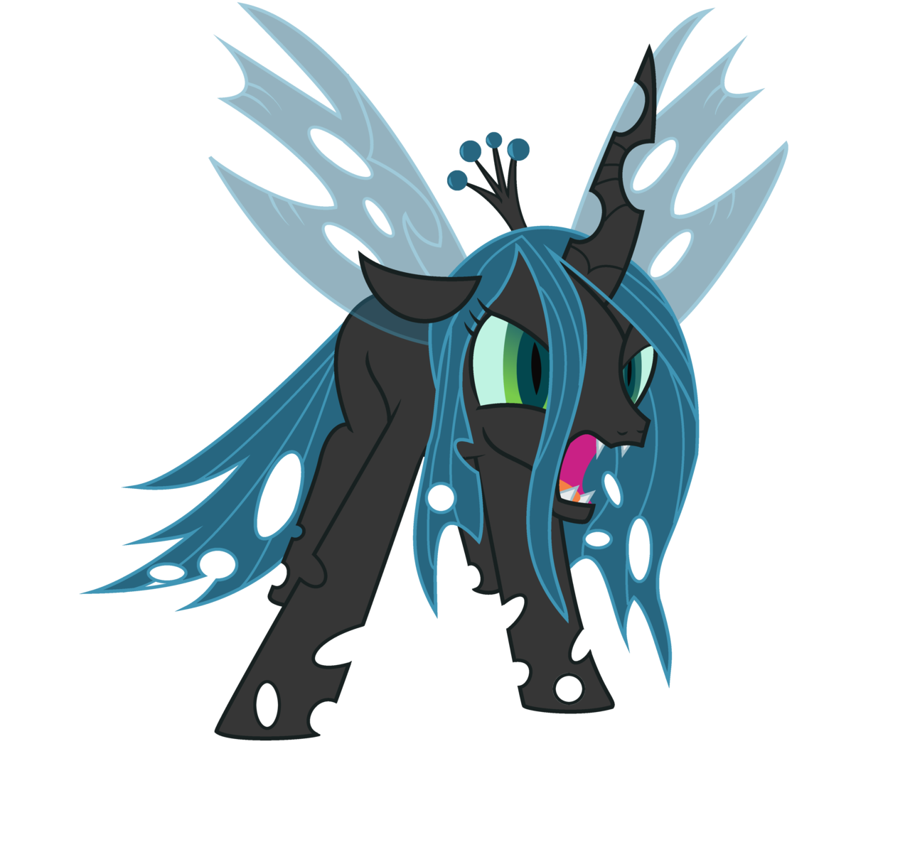
    @Queen Chrysalis: Very nice results. I like especially the viking signature!

    @Legio: Very good work with the avatars. You may want to weaken the glow in the second one, though - now it looks a little unnatural.

    @Willowran: Good, although you should pay a little more attention to the contrast and, on the second signature, the render outline. You should remove the white pixels there.
    Last edited by Goofy; May 15, 2012 at 01:42 PM.

  15. #15

    Default Re: Lesson 3 - Avatars & signatures

    I have a problem, the layer thing wont show up in Gimp anymore!

  16. #16
    Vađarholmr's Avatar Archivum Scriptorium
    Content Emeritus

    Join Date
    Oct 2010
    Location
    In the valley
    Posts
    5,588

    Default Re: Lesson 3 - Avatars & signatures

    Look under windows - last closed windows.
    {I cook weird stuff}-{Patronised by the fearsome Chloe}
    „[...] ţví ađ međ lögum skal land vort byggja en eigi međ ólögum eyđa.“
    (The Frosta-thing law, 1260)

    Is acher in gaíth innocht,
    fu-fuasna fairggae findfolt:
    ní ágor réimm mora minn
    dond láechraid lainn ua Lothlind.

  17. #17

    Default Re: Lesson 3 - Avatars & signatures

    Its not that, Ive restarted the computer twice now and it doesent show up... I mean the layer option bar, where you create new layers etc.

  18. #18
    Beorn's Avatar Praepositus
    Join Date
    Jan 2009
    Location
    Athens
    Posts
    5,327

    Default Re: Lesson 3 - Avatars & signatures

    Go to Windows-> recently closed docks and u will find it.

  19. #19
    Legio's Avatar EMPRESS OF ALL THINGS
    Content Emeritus

    Join Date
    Mar 2008
    Location
    Chlοëtopia
    Posts
    43,774

    Default Re: Lesson 3 - Avatars & signatures

    HELP


    second coming

  20. #20

    Default Re: Lesson 3 - Avatars & signatures

    Original


    With GIMP


    Original


    With GIMP


    Signatures:

    Original


    With GIMP


    Originals


    With GIMP
    Last edited by The Norseman; May 19, 2012 at 04:23 PM.

Page 1 of 4 1234 LastLast

Posting Permissions

  • You may not post new threads
  • You may not post replies
  • You may not post attachments
  • You may not edit your posts
  •