

You could always ask for a front page announcement as well?

You could always ask for a front page announcement as well?
THE WRITERS' STUDY | THE TRIBUNAL | THE CURIA | GUIDE FOR NEW MEMBERS
PROUD PATRON OF JUNAIDI83, VETERAAN & CAILLAGH
UNDER THE PATRONAGE OF MEGA TORTAS DE BODEMLOZE


")
My desktop Kindle seems to have huge gaps in all the wrong places. It may be the hyperlinking chapter headings. I will see about removing them and how that changes the spacing.
What I've posted.If you want any changes let me know.
Spoiler Alert, click show to read:
THE WRITERS' STUDY | THE TRIBUNAL | THE CURIA | GUIDE FOR NEW MEMBERS
PROUD PATRON OF JUNAIDI83, VETERAAN & CAILLAGH
UNDER THE PATRONAGE OF MEGA TORTAS DE BODEMLOZE
Nice! Thanks again - just what we need! Hopefully that will launch it into a wider community here and get the reviews rolling in!
I am going to re-edit the headings to see if I can remove those annoying spaces and page gaps. I think it is because Kindle is reading them as chapter headings and trying to create a gap for them. I will be updating and uploading another version later today.
An hour later:
On the Kindle things are looking okay down my end.
The indent every time there is a new paragraph is quite large, is there a way to reduce it? Also in 'Serving your Oppressor' the indents don't seem to be present? I like how when there's a new 'chapter' in the individual AARs there is a bit of a gap. The only problem I noticed is in Takeda when there is the *** it kind of goes like this:
___ . . .
______. _ . _ . _ . The siege of Matsumoto...
(minus the underscores)
Beside that it's looking good.And the 'afterword' section is a good addition.
THE WRITERS' STUDY | THE TRIBUNAL | THE CURIA | GUIDE FOR NEW MEMBERS
PROUD PATRON OF JUNAIDI83, VETERAAN & CAILLAGH
UNDER THE PATRONAGE OF MEGA TORTAS DE BODEMLOZE
The indents don't exist in the original word doc so that is a mystery to me. The Takeda breaks are always going to be awkward formatting-wise but I think it is better to have that than none at all. What IS confusing me is the PDF version - it now has several paragraph end lines spaced out across the width of the page. That is neither in the original word doc nor the Kindle version. I am scratching my head at the moment re that!
I an off to the cinema now and then out for the evening. I am off tomorrow so will re-format and upload another version then. Once we get all this ironed out then we are in a good position for the future premium export!
Last edited by SeniorBatavianHorse; May 20, 2012 at 01:58 PM.
On PDF the last 2 AARs (Restoring Rome, Serving Your Oppressor) the spacing goes about
The plain txt. versions are fine, although if you download the plain text version and view it there aren't any line spaces. (Viewing it with Notepad/Wordpad)
Online HTML version is also fine, but I'm not sure what's up with the Jave Script online reading version...
The downloadable word version also works/looks fine, but I haven't been able to check the Epub or LRF formats because I don't own the software that uses it.
The only thing that's a bit squiffy is the '***' in Takeda, which looks like how I've shown above on most of the formats.
THE WRITERS' STUDY | THE TRIBUNAL | THE CURIA | GUIDE FOR NEW MEMBERS
PROUD PATRON OF JUNAIDI83, VETERAAN & CAILLAGH
UNDER THE PATRONAGE OF MEGA TORTAS DE BODEMLOZE
")
")
For publicity I could always write an article for the next Quill? If SBH and maybe some other writers are up to contribute some thoughts to it as well, would be a good way to get us known about?
~
RESTORING ROME - CHAPTER II: TRAGEDY OF THE KOMNENOI
bitte sehr
SCHRÖDINGER'S CAT - A VERY SPECIAL FELINE
Sounds good, count me in!
I will work some more on the formatting tomorrow and see if I canm crack those line spacings at the end of the paragraphs!
I'd be happy to help out.Originally Posted by Schrödinger

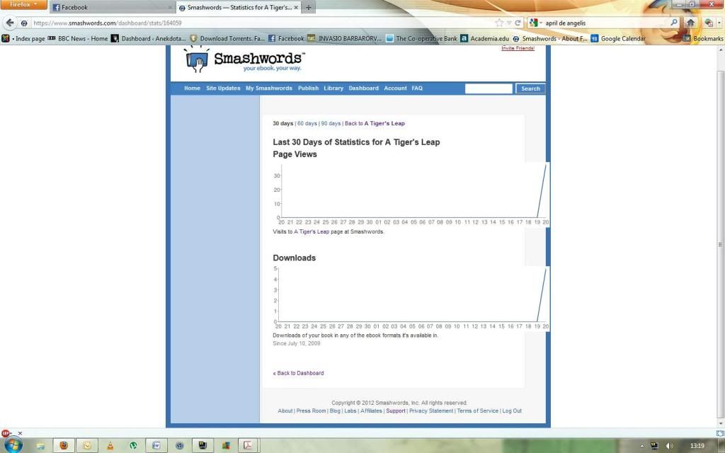
I'm in the process of reviewing it on Smashwords.
THE WRITERS' STUDY | THE TRIBUNAL | THE CURIA | GUIDE FOR NEW MEMBERS
PROUD PATRON OF JUNAIDI83, VETERAAN & CAILLAGH
UNDER THE PATRONAGE OF MEGA TORTAS DE BODEMLOZE
Finished my review guys.
THE WRITERS' STUDY | THE TRIBUNAL | THE CURIA | GUIDE FOR NEW MEMBERS
PROUD PATRON OF JUNAIDI83, VETERAAN & CAILLAGH
UNDER THE PATRONAGE OF MEGA TORTAS DE BODEMLOZE


")


I've had a look at Tiger's Leap Volume I in both PDF and RTF formats. Three things caught my attention.
1. You have mixed the long and short forms of my name, which looks a trifle odd. I thought we'd agreed to use the long form.
2. Serving Your Oppressor has a formatting problem. Use of Full Justify is producing ugly results, stretching very short sentences across the whole line in a number of places.
3. The break between the different stories could be stronger. Maybe increasing the Title font size might help. The best solution though would be to have some kind of break graphic, if such a thing is possible.
^That'll be why the format is a bit wonky.
THE WRITERS' STUDY | THE TRIBUNAL | THE CURIA | GUIDE FOR NEW MEMBERS
PROUD PATRON OF JUNAIDI83, VETERAAN & CAILLAGH
UNDER THE PATRONAGE OF MEGA TORTAS DE BODEMLOZE
")
")
")


Many thanks for SBH for organising this and a pat on the back to all involved.
The breaks in Takeda do look a little strange. It seems as if the break is correct but then for some reason there are extra full stops in the next line...
A front pager sounds good - SBH it would be good if you could PM Mr. Bond who's in charge of such things.
Last edited by Robin de Bodemloze; May 20, 2012 at 10:02 AM.
The Wings of Destiny - A FotS AAR (Chapter 12 - Updated Apr 24)
Takeda - a Shogun 2 AAR (Completed) Reviewed by Radzeer
My writing | My art | About me | Sekigahara Campaign - Developer
~~Under the proud patronage of Radzeer, Rogue Bodemloze. Patron of Noif de Bodemloze, Heiro de Bodemloze, and Hitai de Bodemloze~~
Oops, missed that. My apologies. I will correct that tomorrow.
Yes, I mentioned the formatting issues re Serving Your Oppressor in an above post. I am at a loss as to why this is happpening. The draft PDF was fine and I haven't changed any formatting except to add a paragraph break. Again, I will look at that tomorrow and upload an updated version!
Title size is crucial to formatting. Any larger and it runs the risk of creating spacing issues. I will see what I can come up with re graphics as I think your suggestion there is probably the best way forward!
Thanks for your imput!
I have looked at the RTF version, and I notice that the paragraphs with the spacing problem have new-line characters instead of paragraph breaks. If you look at the RTF in a word processor and switch to display special characters you will see.
Try going to the end of such a line, press delete to remove the soft-break, then press enter to add a hard one.
")
")
")
Downloaded, and will be on my kindle shortly.
Patronized by Paedric Patron of Knonfoda and Maurits
A Rickety Old Bookcase
Thanks to Emperor of Hell for the original avatar and FrostySOTF for the update
Go here to get yours
~ Tale of the Week ~ Creative Writing ~ The Writers' Lounge ~ After Action Reports ~ MAARC/BAARC ~
")
Downloaded. A great introduction SBH! I'll review it once I finished reading!
The White Horse: Hanover AAR (On going ETW AAR)
Tales of Acamar: Legends WS Yearly Award Best Plot Winner (On-going CW Piece)
The Song of Asnurn: An Epic Poem MCWC VI Winner (On-hold CW Piece)
Tales of Acamar: Outbreak (Finished)
To Conquer the World for Islam A Moor AAR (Finished)
downloaded- looks pretty swanky.
Rep for all (:
 Posting Permissions


 Reply With Quote
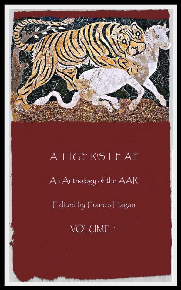

 ...is my daddy!


