Sharpen tool giving me nothing


Sharpen tool giving me nothing
Ok po primo: sorry for double post..
secondo: I was playing with gimp, checking some things with leyers and editing them...


")


")
Try choosing higher quality stock and also try changing the border. I like the idea and composition of this sig, but you need to take care much of the realization. Keep it up!
+rep for your good composition
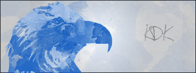
Patronized by y2day/Patron of KDK, Swagger & Navajo Joe, of the Imperial House of Hader
@ thanks cedric for advices but i started another sig
But i want to do something like in here:http://www.twcenter.net/forums/showthread.php?t=317235 point 22-I have some problems with those gradiens options...
You know i want mix colors somehow
Again i like the composition but you need to really work on the quality of the renders and this starts by choosing good/HD renders. If you can improve this, your sigs will improve a tad.
Patronized by y2day/Patron of KDK, Swagger & Navajo Joe, of the Imperial House of Hader

")
the monk sig is a big improvement from the other sigsbut as cedric said u have to work on the renders ! maybe get a trial version of photoshop or something that will offer u a way better tools than gimp does
Yes i will search for some renders...
Announcement!!!
I have acces to pics of units from disciples 3!!!In my opinion they could be good source for avatars,renders or even sigs...In dds formats:
Demons:http://www.gamefront.com/files/20045...disciples3.rar
If like it i could get another five factions pics.

Last edited by T&D; February 26, 2011 at 01:28 PM.
Uptade:
Elves: http://www.gamefront.com/files/20047222/elves.rar
Empire: http://www.gamefront.com/files/20047232/empire.rar
Neutral: http://www.gamefront.com/files/20047234/neutral.rar
Undead: http://www.gamefront.com/files/20047241/undead.rar
http://www.gamefront.com/files/20047246/story.rar
In future i will propably make avatars of all of pics...I will post them in first post.
PS First post uptated.
Last edited by T&D; February 27, 2011 at 04:28 AM. Reason: new links
I am working on new Mr monk sig what you think about this???Maybe add something else to it???
ure renders are getting better and better

")


You have such weird style, which is not always a bad thing.
For high quality render/cropping use the pen tool or at least the magnetic lasso tool, they are both kind of hard to use but you get the hang of it after some time.
It would be funny if your thread was called T&A workshop
What do you think about it??
PS I have some problems with avatar
Last edited by T&D; March 18, 2011 at 10:26 AM.
What do you think about this???
Spoiler Alert, click show to read:
")
To be honest, then its no brilliant, mate. The smudging isnt very good, colors are off and WAY to busy , sorry..
Yes i know that that isn't brilliant and thanks for constructive critism.
PS colors off???
Last edited by T&D; April 05, 2011 at 03:27 PM.
For example: These colors fit very well together:
Could be useful...If i get something interesting i will post here-or in this thread...
PS: Better???:

Last edited by T&D; April 06, 2011 at 06:52 AM.
I must practise...
aaaaaaaaaah .jpg format! Use PNG! (and yes, practice. you still need it. Think of some smoother colour combinations, also less pixels)
 Posting Permissions


 Reply With Quote