To Be Honest


")


")
To Be Honest
Patronized by y2day/Patron of KDK, Swagger & Navajo Joe, of the Imperial House of Hader
I have an question it is possible to make bigger pics in gimp???I want make those pics bigger if somebody could do that i would be pleasured:
well, these photos are small, if you resize it, it'll be Low quality and pixelish.
")
I've resized them 200%, I can keep going bigger if you like but eventually the quality will be no good or my laptop will give up (the program I used is very resource hungry) You might want to sharpen them some more as well, i gave them a little unsharp mask
Balian you are epic man
PS:must spread some rep before giving it again to you.
PS2:I have been playing with gimp and discovered a tool(sharpness)....Epic fail...It was almost in my nose...
resized pics:
Thanks man, if you're using GIMP have you tried the FX Foundry? It has some good sharpening tools, it adds a heap of other cool scripts/filters to GIMP.
I have downloaded it today...
Update:
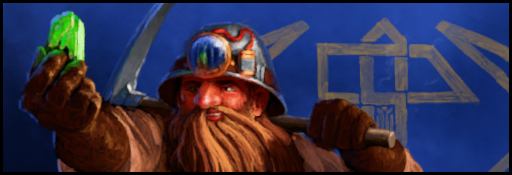
Orc/Angmar bodyguards:
Orc crossbows:
Angmar general:
PS: Somebody maybe know any cool egypt/ancient/tomb fonts???
Last edited by T&D; February 15, 2012 at 09:48 AM.
You should really reduce the skull size on the angmar bg, at least by 10% maybe 15-20%
Just think of it as a snaga skull
About nice fonts, check here
Patronized by y2day/Patron of KDK, Swagger & Navajo Joe, of the Imperial House of Hader
I was checking that site today!
And i've faunded blade II in modern section
First attempt for loging...

Good for a 1st attempt, now you need to work on the letters effects etc. and maybe reduce the stuff behind the letters
Also, how come the letters looks pixelized ?
Patronized by y2day/Patron of KDK, Swagger & Navajo Joe, of the Imperial House of Hader
Ask Scale option
Yep i must work on letters etc.It's the worst part.
It's easy make your letters as big as possible (dunno generally i found for me that 1024x768 is more than enough unless you really want to get some very HD stuff), then reduce, instead of increase the size of letters. Also add a texture with the text shape, and use this texture as a base. Then don't hesitate to add layers to give some 3D and nice looking effect on the letters !
Patronized by y2day/Patron of KDK, Swagger & Navajo Joe, of the Imperial House of Hader
Mass effect renders:
")
")
Cool! How is your orcs project progressing btw?
Not fast....I'm studing so i need someone to code them after that maybe i could do some new units.Or another ,,little-(pacs of units)'' projects.
Do you mean code them to EDB?
Some new stuff(will pack all my renders):


")
What I think you might need to work on is the business of your signatures. Especially when it comes to combining text with pictures, you need to make certain that the eye is able to read the text without hindrance; however if you make the immediate background behind the text too busy, it will be hard to read, and that draws down the attractiveness of the whole composition, even though everything apart from the text is absolutely wonderful (this is something I, too, am prone to, and some signatures are indeed better without any text whatsoever). I think the Tigris and The Sundering signatures you provided above could use some finetuning in the text-image relation. The moon in the middle feels somewhat too bright, at least in the areas where the text is, and in the Tigris signature the text could be somewhat brighter while the borders could be toned down, I think.
But I wish to point out that apart from the text, the overall composition of your signatures has become markedly better.
Originally Posted by Adar

UNDER THE PROUD PATRONAGE OF ABBEWS
According to this poll, 80%* of TGW fans agree that "The mod team is devilishly handsome" *as of 12/10
 Posting Permissions


 Reply With Quote