Congratulations, really great piece.


")
Congratulations, really great piece.
Under Patronage of MARCVS
")
")
")
I must quote him, anymore can be said, is an authentic masterwork, trully inspired and hard worked, I think it is your bet work posted here, you have really done a wonderful work in the waves, the seas and the explosions, even the degisn of the ships is trully original, fantastic but realist at the same time.Originally Posted by Skyn0s

I cannot say anymore, just perfect:
+rep
(I would even double rep you if it were possible!)
There is only one detail that disturbes me, the right hand of the first musketeer (the one without hat), maybe its just my point of view, but looks a bit unnatural and forced. Just a humble suggestion.
Regards
Oznerol
Last edited by Oznerol; June 29, 2012 at 04:54 PM.


")
Thank you for your input everyone! I will make sure to take note on what you have written for my next pieces.
Now, here's something minor while I contemplate on how to continue with another large piece of mine:
UNDER THE PROUD PATRONAGE OF ABBEWS
According to this poll, 80%* of TGW fans agree that "The mod team is devilishly handsome" *as of 12/10
")
Really explendid work on this piece and the previous is just divine, you can almost feel the ship bouncing and the emotions of those men. It's an epic piece as good as I thought it would be since you posted the first WIP of it and kept me coming back for the final result. +rep sir!

")
")
")


")
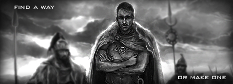
Scary

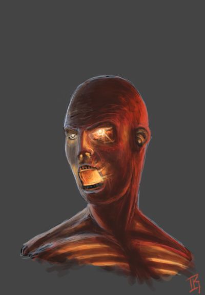
Thanks MBA, but here's something even scarier:
Yes, that is the closest thing to a self portrait you will ever see from me.
Except... I made a cameo (or rather, tried to, so this one is quite difficult) in one of my earlier works. Can you guess which, and where the cameo is?
Last edited by Aanker; August 06, 2012 at 03:42 PM.
UNDER THE PROUD PATRONAGE OF ABBEWS
According to this poll, 80%* of TGW fans agree that "The mod team is devilishly handsome" *as of 12/10
Your avatar?
Nope.
It's a good guess, but I am not so good at drawing myself that I can do it from such an angle.
UNDER THE PROUD PATRONAGE OF ABBEWS
According to this poll, 80%* of TGW fans agree that "The mod team is devilishly handsome" *as of 12/10
Another minor thing:
UNDER THE PROUD PATRONAGE OF ABBEWS
According to this poll, 80%* of TGW fans agree that "The mod team is devilishly handsome" *as of 12/10
")
Nice
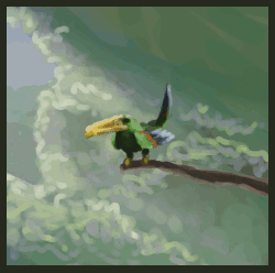
Thanks!I did it as a way of getting some variation while working on this:
Spoiler Alert, click show to read:
The original (not derp resolution, I wanted to upload it at this size because too much zoom will make it hard to get an overview) can be viewed on my DeviantArt page.
The banner version:
Spoiler Alert, click show to read:
UNDER THE PROUD PATRONAGE OF ABBEWS
According to this poll, 80%* of TGW fans agree that "The mod team is devilishly handsome" *as of 12/10
You never fail to impress, Aanker.
+Rep
")
Fantastic work here.
As always.
+rep
Skyn0s
EBII fan appeal: The Europa Barbarorum II team [M2TW] is in dire need of YOUR HELP RIGHT NOW! - Dear modders, please get in touch HERE!

This TWc place has a heck of a lot more stuff to it than just TW games.
I had no idea there was a whole Art section too! Very nice work too, btw.
Last edited by Humble Warrior; August 23, 2012 at 02:23 PM.

One thing that always occured to me in your works is those rough lines/hard edges. Have you ever tried smudging the rougher lines ? I mean like the downward lines on the soldier's sleeves, or on his trousers
I need to check my threads more often
Thanks everyon!
Yeah, I've thought about this, too. I just think smudging is a bit of an unclassy solution, and I have begun to realize that digital art work should not be viewed in the full resolution they were drawn in, but rather from a zoomed-out perspective (so if it was drawn in 1280x1024, it should be viewed in something like 80% of that size).
Another disadvantage of smudging is that it can easily lead to a runaway effect; imagine smoothing the edges and then finding the main surfaces not blending enough in relation to them, and thus smudging the main surfaces...
It's tricky.
UNDER THE PROUD PATRONAGE OF ABBEWS
According to this poll, 80%* of TGW fans agree that "The mod team is devilishly handsome" *as of 12/10
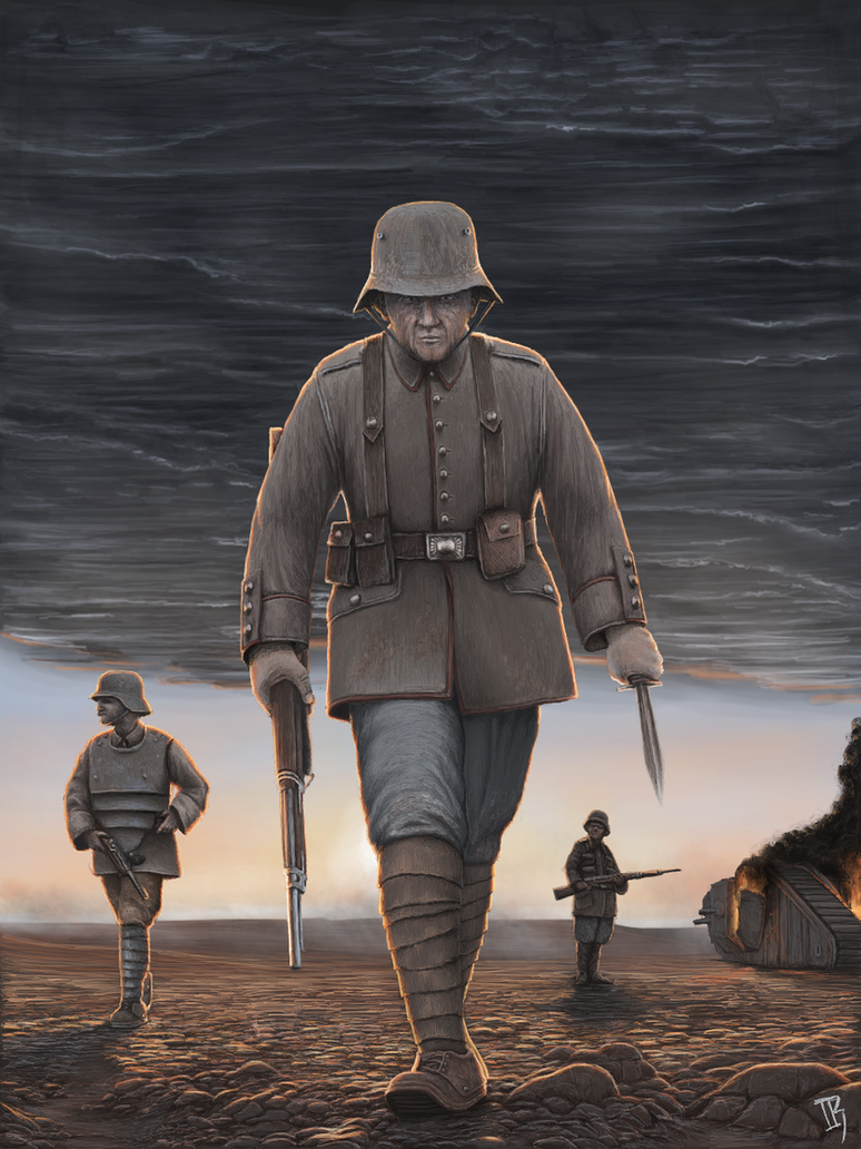
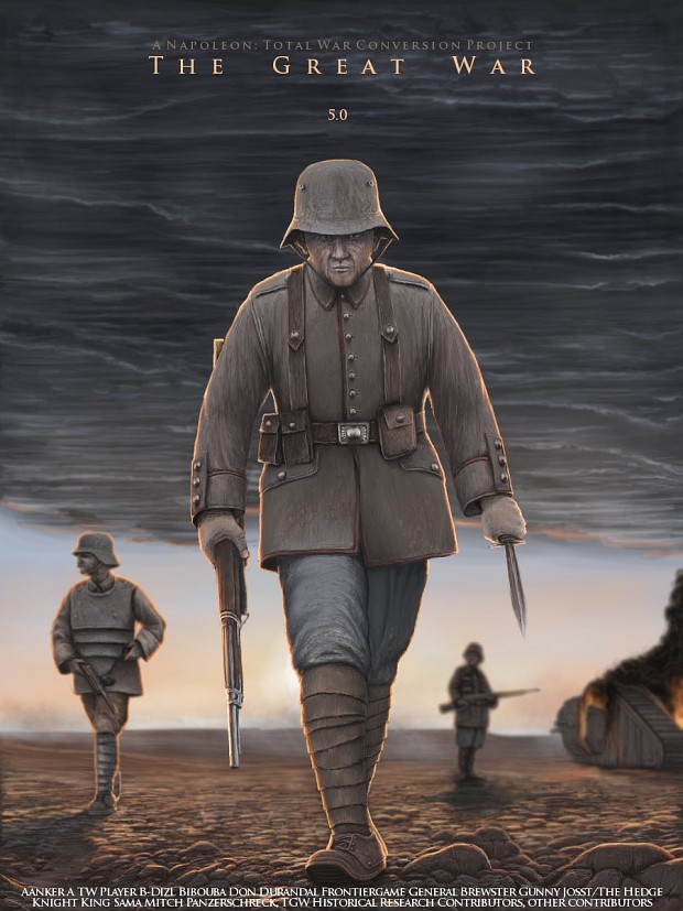
I really love the last one, it is trully well done, the light efects, including the sunshine and the flames of the destroyed tank. The detail in the uniforms is also as amazing as the rest of the artwork. The leather stripes around the soldiers legs are stunning, are trully well done, as the footgear who looks very real. Also liked the detail of the armored soldier in the left. The metal sufaces are amazingly well done.
I only don't like one thing: The central soldier's face, he looks almost septuagernarian, doesn't reflect the real age the character would be, if he wanted to be a german stormtrooper (As they are), being a shock troop he should look much younger.
Just few comments and a humble suggestion.
Regards
Thanks for your kind words and your input!
I really was not aware of the Stormtrooper medium age, but I can imagine that you are correct in this respect (as they were basically the handpicked most fit soldiers of each German average infantry unit). When I designed the artwork, my vision was to make something "badass" (hopefully that doesn't violate the ToS), but I might have overdone it.
UNDER THE PROUD PATRONAGE OF ABBEWS
According to this poll, 80%* of TGW fans agree that "The mod team is devilishly handsome" *as of 12/10
Always a pleasure!
You painted the scene wonderfully! And I'm glad that you liked my suggestion/commentary.
I have forgotten to tell you how good have you painted the rocky floor, impresive work. That reminds me what I'm painting right now, nearly the opposite thing, a scene with a swampy, flooded, muddy terrain.
Hope you will bring us more and more of these wonderful artworks! I will eager wait to see what more can you do, another sea battle? Tanks? WWI battles? It won't mind, they will be as good as always.
+rep Aanker.
 Posting Permissions

 Reply With Quote