- Let's start by making a new image with 800 by 600 px as size.
-Make an new transparant layer
-Write your alias or something similair but shorter like I did, in the layer with a bold font without to many little things on it. I used the Cruzy Bold font witch is for download at
www.dafont.com. You can choose whatever color you like as long as it is not to dark.

- Now take your perspective tool and make the text so you look upon it and it comes from the BG. Sorry but I can't explain it any better. Take a look at the pictures for better clarification.


- Now duplicate your text layer. Take the bottom of the two and give it a different color. (This is easily don by color>colorize) And place it a tiny bit under the top text layer. Make sure it all fits perfectly.

- Duplicate the colorized layer about 3 times and keep placing them a little bit under the previous layer.

- Now to speed the process up a bit. Set the top layer (red text with me) to invisible just like the white BG layer. Then right click in your layer window and select merge all visible layers.
- Make the other layers visible again
- Duplicate the merged layer 4 times and start placing them under eachother again.

- We've got a 3d text now but it is still a bit rough see the the letters at the left in mine and there's also zero shading.
- First w'll be setting the top layer and the BG layer to invisble again and so we'll merge all the visible layers again.
- Set the other to visible.
- Go to the merged layer and correct the edges by using the smudge and the eraser tools. Most of the time some smudging on the edges will do. If there are any visible projections you delete them using a the eraser tool. Remember to zoom in far while doing this and doing it carefully. If you do this negligent you can easily make it worse.

- To make the next steps possible where going to delete the white BG layer.
- Now we're going to do some simple shading.
- Make a new layer and place it above the merged layer. Fill the layer with black. Set the layer mode to hard light and opacity to 30 %

- Take your eraser tool, select a fuzzy cirlce brush and set the opacity to about 30 %. Now start to delete the shadows at the points where the aren't ment to be. So pieces will require you to go over it multiple times!

- Now w're going to bring some life to the red part of the text.
- make a new layer set it completely on the top and put a black-white gradient in it.

- Take your perspective tool and let the gradient follow the writing like this:

- Set the layer mode to dodge. And the opacity to 60 %

- Now duplicate the non merged text layer (the red on in my case). And place it completely at the bottom
- Make the letters black and put the layer completely at the bottom
- Take your perspective tool and put the shadow straight on the floor like this

- Give it a gaussian blur of 5 and set the opacity to 50 %. AND WE'RE DONE!


")


")


")
")

")


")
")
")

")


")

")

")


")
")
")

")
")

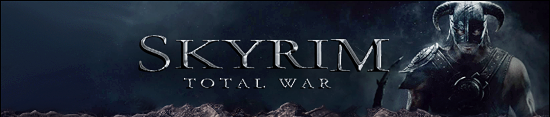


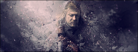
 ...is my daddy!


