Thanks


")
Thanks


I like it, but that white border is horrible.
Any suggestions then ?
Yeah, a black one. And make it smaller, too.

")
")
Very nice!
Btw, this was made on a bigger image, and it looks worse resized.
@ Fev : Black border doesn't look as good imo. Here it is :
White
Black
")
")
")


")
Why not make the border becomeing white, from a black left side to the right ?
Cause for some reasons both do not fit 100%


")
You're right, it should be faded from black to white from the left part of the border to the right.Originally Posted by MasterBigAb

UNDER THE PROUD PATRONAGE OF ABBEWS
According to this poll, 80%* of TGW fans agree that "The mod team is devilishly handsome" *as of 12/10
")
And make it thinner.
Son of Legio
Father of Paedric & RemlapRoma Surrectum II, Ages of Darkness II, Rome Total Realism & RTR: Imperium Surrectum Developer
Mundus Bellicus - TWC - ModDB - Discord - Steam
You don't seem to do it right, Killerbee. Press ctrl+a and then edit->stroke and select something about 1 or 2 pixels. And do not fade it, that'd look stupid.
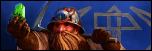
I'm still a bit rusty, but here's my comp entry :

")


Nice!
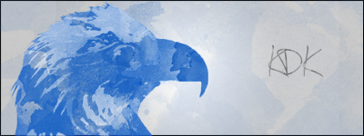
Patronized by y2day/Patron of KDK, Swagger & Navajo Joe, of the Imperial House of Hader

")
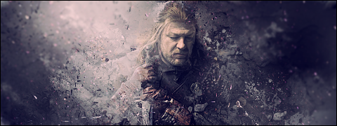
Don't like it at allReally weird focus going, I mean everything blends on the right and nothing on the left, why? Other than that the focus is on his left shoulder, the text is to much erased at the edges. If you want it to look like the text is behind the super duper tier 1 solder, use a layer mask and softly erase randomly everywhere, not only on the edges.
I felt no need to blend the left, and I still don't. I mean, the focal's on his shoulder/neck, and I think you don't need to smudge focals.
As for the text, I suppose you could say I was extremely lazy
Yeah but focal, if on a human, should always be on the head/face.
New signature


")
")

")
")
looks good but you are makign too small signatures. They look a square!
Son of MasterBigAb; Father of St. Polycarpe Kahvipannu Radboud Mhaedros GeMiNi][SaNDy
Flinn UndyingNephalim KAM 2150 Charerg
Well I had a bigger image first (430*140) but the render wasn't wide enough so the left and right side of the sig were too boring. That's why I decided to cut it. I prefer small but intensive signatures over big but boring ones
Looks good
Nice sig, i don't much care the shape, the content is more important
Patronized by y2day/Patron of KDK, Swagger & Navajo Joe, of the Imperial House of Hader
 Posting Permissions

 Reply With Quote