I'm having difficulty with the gradient. Could it have something to do with my layer picture being a clan tartan?


")

")
I'm having difficulty with the gradient. Could it have something to do with my layer picture being a clan tartan?
Son of PW

")
")
")


")
The image itself shouldn't be a problem. Did you add a layer mask and did you pull the gradient from one side of the image to the other one afterwards? Once you have done that, make sure to select "Apply Layer Mask". Finally, keep in mind to have the layer in question (e.g. the clan tartan) selected when performing any of these actions.
Last edited by Astaroth; May 22, 2009 at 02:01 PM.

Sorry for taking so long, I had a lot to do. Anyways, here are my images:
1.
I forgot to do pretty much all the steps with the text and just used Gaussian blur. I was thinking of fixing it, but I liked the way it came out, so I did not.(let me know if you want me to change it)
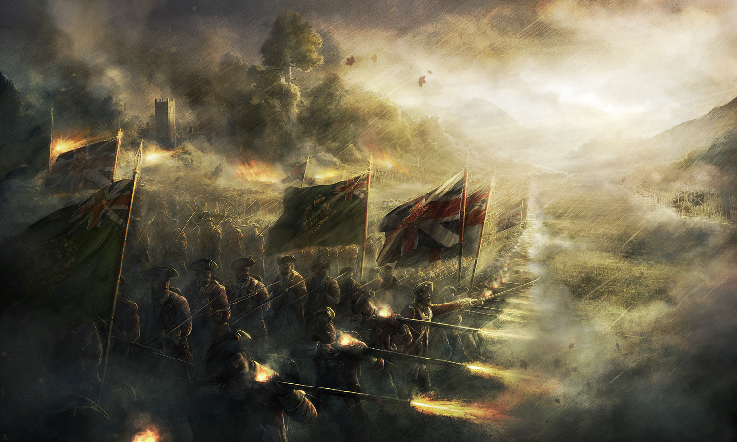
The original images:
Spoiler Alert, click show to read:
2.
With this one I cut out the fiddle from the main image and put it on a black background. Then I made a new layer and made a oval of white and lowered the circle's opacity.
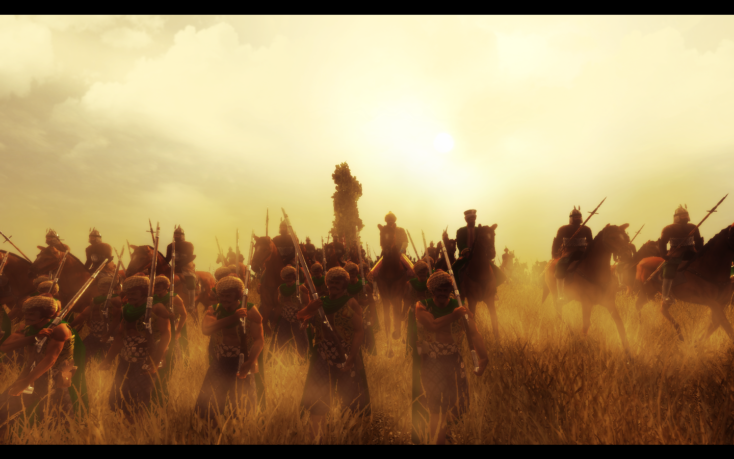
The original image:
Spoiler Alert, click show to read:
3.
With this one I used a text that already seem 3D, so I did not use Gaussian blur. I used animated confetti for the border. It did not come out all that well, so let me know if you want me to change it.
The original image:
Spoiler Alert, click show to read:
I've got a problem, I don't know to erase the line in the flag
Part A Redone:
Part C:
Spoiler Alert, click show to read:
And my 4 original pictures:
Spoiler Alert, click show to read:
Spoiler Alert, click show to read:
Spoiler Alert, click show to read:
Spoiler Alert, click show to read:
Nice!
Proud patron of Wlesmana
Assyria Total War
Check update thread for new HQ models
My Workshop
First:
Son of PW
Looking good
Proud patron of Wlesmana
Assyria Total War
Check update thread for new HQ models
My Workshop
the kilt overlay would look really cool with a buckler on the other side.
Part B
OK I been messing a lot with this picture and finally something interesting came out. Enjoy my vampire pet, just fed it! LOL!
Used blood and grunge brushes a lot. The pattern behind the text is a brush, I just filled part of it with black. Finnaly I deformed the outline of the sig with a grunge brush and stroked it black.

your sig is 550x260.It must be most 550x175
Proud patron of Wlesmana
Assyria Total War
Check update thread for new HQ models
My Workshop
Lose a bit of the blood spots, make the remaining spots darker and more intense, for a greater "dark" feeling. But that's my opinion and I have a relatively untrained eye for this game.
")
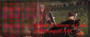
My very pathetic attempt at part A :
The text is a tad hard to read.
It looks good Aster
Proud patron of Wlesmana
Assyria Total War
Check update thread for new HQ models
My Workshop


")
")
")

")
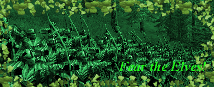
Part B
The original image:
Spoiler Alert, click show to read:
Part B:
I took a screen inside a TA:TW battle, cropped and tinted it green, then used the vine-leaf brush to add a border. Sorry, but grunge just didn't go with my theme.
Is part C optional or something? I've created the two signatures homework demands, so is the third one necessary to pass?
Son of PW
No, part C is optional.
Thank heaven! :mops brow: I'm just not going to have time to get into something of that complexity this week.Originally Posted by Tzar


Son of PW
Ok, I'll be on holiday from 30th of May to 14th of June.
@Astaroth: Could you please post the lesson on Wednesday, so that I got the time to finish it?
Or Could you give me time until I returned (a week max. )
 Posting Permissions