Results 1 to 2 of 2

Thread: Need help modding/designing American monarchist flags

  1. #1

    Default Need help modding/designing American monarchist flags

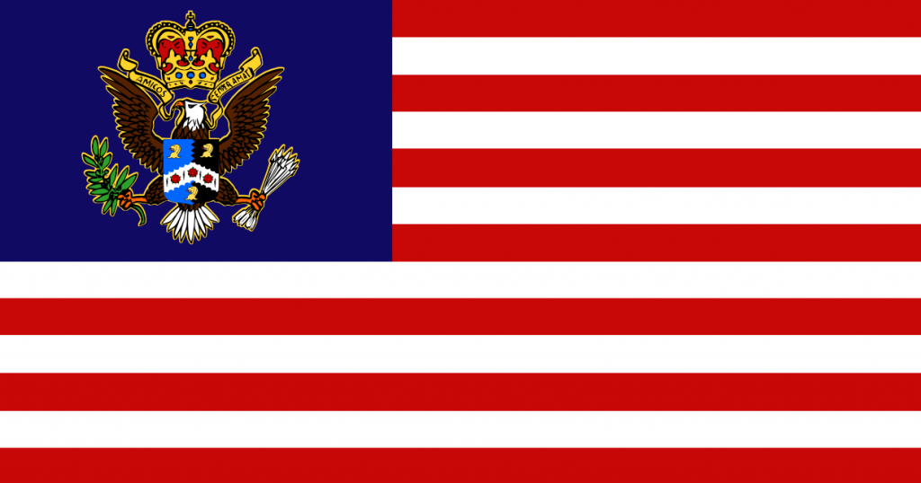
    I've been working on a mini mod for the monarchist American flag. I have designed some flags already but I don't know which one is the best. I'm not much of an artist so I was wondering if someone could do new versions of the flags that look better and more in step with the Empire style. I will admit that the first flag was largely inspired by the American monarchist flag from the Total Flags mod, I basically just added my own coat of arms and motto.
    Spoiler Alert, click show to read: 

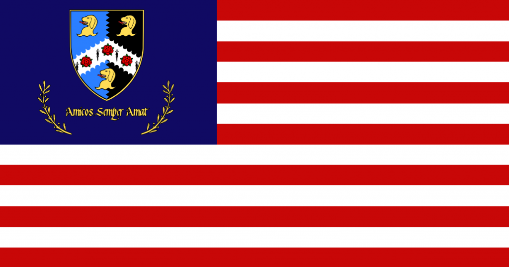
    This second flag was my attempt at originality.
    Spoiler Alert, click show to read: 

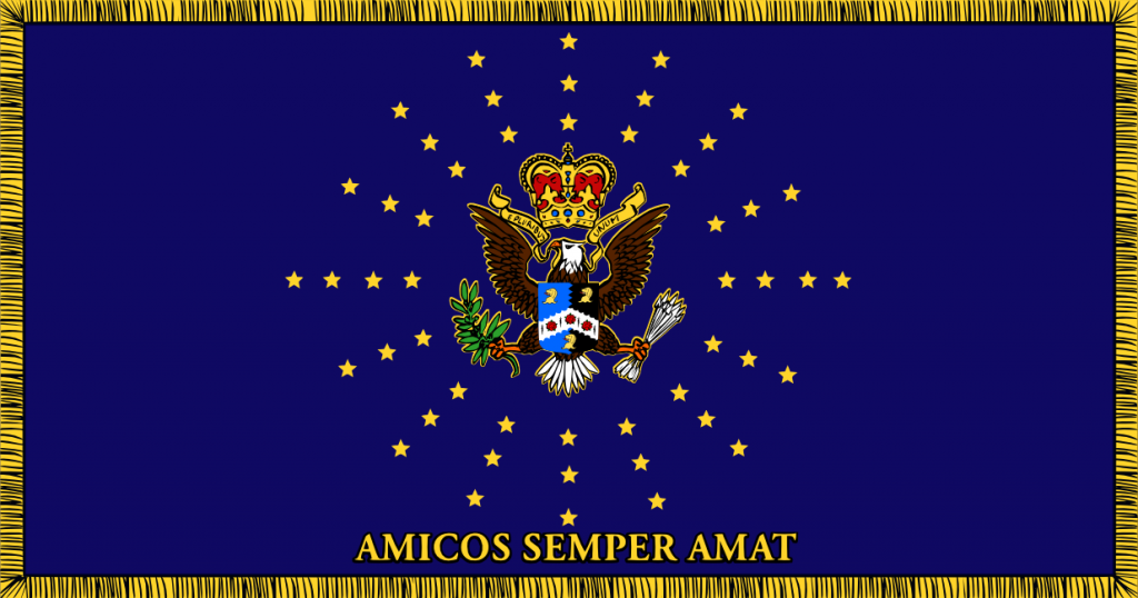
    The third flag is the most blatantly "monarchist" of all the flags I think. I kinda mashed a bunch of different flags together for this one.
    Spoiler Alert, click show to read: 

    Any input about which one is the best/improvements to make are welcome and I would also like any help making fancier looking versions of them.

  2. #2
    Laetus
    Join Date
    Dec 2018
    Location
    Grabill, IN
    Posts
    1

    Default Re: Need help modding/designing American monarchist flags

    Sorry I don’t even know anything about Total War games, & my computer prob. couldn’t run them anyway b/c it doesn't have much RAM, but when I found your thread, I thought I might still help some w/ your flags. I think it would be a good idea to look at what the N. Amer. Vex. Assoc. has on the subject. Esp. ‘THE COMMISSION’S REPORT ON THE GUIDING PRINCIPLES ON FLAG DESIGN’. Basically, I think a flag is supposed to be simple, but distinctive & symbolic. Something immediately recognizable in the heat of battle, which troops will want to rally beneath. Apparently you know about heraldry. The design of both flags & coats of arms is very similar, & they can overlap & are largely intertransferable, e.g. Cross of St George as heraldic device & on the English flag, which has been particularly successful in both cases, b/c it meets all requirements so well.

    #1: This looks like it has 9 colors (red, white, gold, dk blue, light blue, black, brown, green, & orange), which is a lot. Just the coat of arms has 6, also 3 types of charges w/ 10 total charges, an ordinary, & 2 types of line. I think it’s a good design, for heraldry, but pushing the limit of busyness. Then w/ stripes & canton in the overall design, it’s cluttered &out of proportion: tiny in the canton, big otherwise. The best flags have 2 or 3 colors, usu. They might have as many as 6 & still be successful, but 9 is super-busy. And you’ve put the device of a seal on it, which is minutely detailed. A seal is made to be embossed on a flat sheet of paper, or pressed in wax, & seen up close. It can & prob. should have as much detail as will show up in that case. But on a flag, it will blur from distance & movement, & will barely be seen, or not at all, when the wind isn’t blowing. Too much like the Stars & Stripes, I think, which pushes the limit of # & smallness of stars (I think semy of mullets would be much better—designers should have done it from the start & the flag wouldn’t have had to be redesigned, w/ difficult arrangement of stars, so many times—the flag never would have gotten outdated). Manufacturing this flag traditionally, i.e. piece-by-piece, would be impossible, & embroidering the seal device would leave the reverse unrecognizable, so the only way to make it would be printing, which looks cheap. But the printing would be relatively expensive b/c of all the colors.

    #2: Removing trappings makes it somewhat better (less cluttered, less tiny), but adding words is worse: as the report says, ‘one might simply write the name of a country or location on a white sheet and wave it around.’ And of course the reverse of the flag would say, ‘tɒmA ɿɘqmɘƧ ƨoɔimA’! Also the meaning of the words isn’t unifying, similar to 1-star-per-state concept. ‘Amamus’ would be a bit better, but you’d still have words. And they’re good for peacetime but prob. not so much for battle. Anyway, a flag should symbolize what you want it to mean.

    #3: My 1st impression was it was supposed to be like the EU flag except w/ a lot more stars. Not sure if that’s a relevant connotation. And the EU flag has suffered from the same tedious star-token problem the U.S. flag has. I do like the starburst effect. Not sure if that part might still be a bit busy though. This 1 has most of the same problem as the 1st 1 w/ clutter & the 2nd w/ words, sorry.

    So generally, fewer colors, simpler layout, no words, & prob. a bit more distinctive from other flags. I’d combine just a few of the many elements. Some rough examples (things like #s of stripes & proportions aren’t exact):

    Spoiler Alert, click show to read: 


Posting Permissions

  • You may not post new threads
  • You may not post replies
  • You may not post attachments
  • You may not edit your posts
  •