Post assignments here.
If you have any questions, feel free to PM me here, I'm on much of the day.
If you need help, you can add me to your MSN,I can also meet on Ventrillo or Skype if you'd like.Code:rgalanakis@optonline.net


Post assignments here.
If you have any questions, feel free to PM me here, I'm on much of the day.
If you need help, you can add me to your MSN,I can also meet on Ventrillo or Skype if you'd like.Code:rgalanakis@optonline.net


OK Guys,
Let's start posting our creations and giving each other constructive criticism!
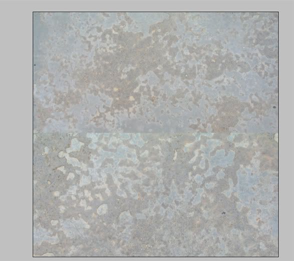
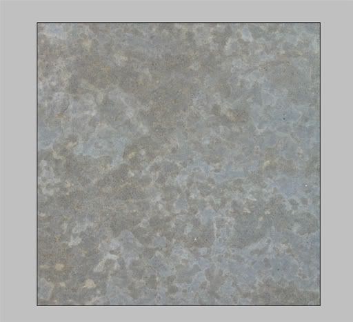
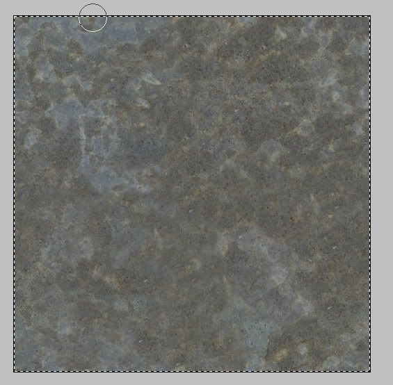
Here's three images that will show you what I went through in order to make a marble texture.
I followed the tutorial excactly and the last image is the result that I achieved by doing so. It looks nice on my desktop as a background.
I was working on an ice and rock texture, but due to complications with the textures themselves, I didn't finish them, I plan on going back onto those textures after tomorrow's Government final.
Last edited by Professor420; June 26, 2007 at 11:00 PM. Reason: converted to img tags
")
Here is my attempt. I made a wood texture.
At the beginning:
After 1st offset:
Final verdict:
Thanks for the wonderful tutorial Prof
RIP Calvin, you won't be forgotten.

start
finish
hmm doesn't look that square in the screenies tho
and the final bit (sorry missed the objective of this part, thought it was another method)
but as i went along i got less and less light bits
Last edited by _TubbZ_; June 27, 2007 at 02:12 PM.


")
")
")

My fist attempt:
Start
Result
Tell me if it needs anything.
Last edited by Professor420; June 27, 2007 at 12:36 PM. Reason: fixed links
Check out my YouTube Channel hereOriginally Posted by Jom

Under The Patronage Of jimkatalanos
Patron Of Murfios, Bolkonsky and DekuTrash
HistoryGuy: Excellent work overall. One thing you'll find with the clone bush, is when you use it at 0% hardness too much, the edges become pretty greyish/unsaturated, blurry and unclear. You can remedy this by using a harder brush, and also putting it on a new layer and layer masking parts away. For example, if you follow a crack, you can get a nice hard edge to the 'fix' but there won't be a seam. You want textures to be as sharp as possible, those blurry areas caused by the clone brush's softness are no good and jump out as "photoshopped."
romanman: Not a bad first attempt.
First, you need to make sure the texture tiles. I tried offsetting it, it still doesn't match up. Its any easy fix, but seams on these sorts of textures should be invisible. Its unlikely you'll ever use these "raw," to to speak; generally you will overlay some grime and dirt and decals or something to make it more "interesting." Tiled textures though will form the "base" texture, so they need to be spot on.
Second, and related to the same reasons, are there are too many landmarks. Deep cracks are going to stand out alot, so either get rid of them, or soften them (with selectively applying a Levels to lighten them up.
Third, is lighting/color correction. Something I didn't go over: The photos you used were taken in direct sunlight. This has two effects: first, is shadows, as I described above. The second, is a somewhat yellowing of colour. Its not something you may need to do, but keep in mind, that the color of light can greatly influence the color of a surface.
Finally, there are some execution issues. There are seams from your overlays and adjustments in other places except the edge.
msTubbz: Very good job on blending, but it doesn't tile! That is a large part of the task, as well, to get the textures to tile. You've blended them very well, now apply an offset filter and work on making it tile.
LtL: Remember the goal is not to overlay two textures, but to use two smaller textures to occupy a larger space. You've used two wood textures that cannot easily be combined. When we look for photos, what's most important is that the texture of the surface is similar. Color, relative values and luminance, etc., can be fixed with Adjustments. However, in your case, the grain of the wood is very dissimilar, and thus you can't really get the two textures to link up correctly. (for example, texture would be a marble grain/vein, rusting or spotting on metal, grain on wood, creases and texture on leather, etc.). You COULD actually fix the 'arc-ed' photo with some transforming and Liquifying, but its pretty complicated. As it stands now, one can see the two original photos and their delineation quite clearly. The image adjustments are good (values and hues and saturations match up nice) but the photos you chose were poor... I'd get rid of the arc-y and circle-ly one for a wood that has a similar grain to the second original pic.
Overall, great job so far everyone. It is really rewarding to see people hand in assignments. Keep going with improvements until you get it right- this is one of the most fundamental aspects to texturing anything. From here, you can establish a good base for ANY type of texture (environment or character, prop or landscape, last gen or next gen). With a poor base texture, its not going to look good.


Started with 2 big blurs:

And made an even bigger one:

RTR website/SVN admin
- Settlement coordinate locator -for RTW/M2TW
- EDB Validator v1.2.8 (Oct 16, 2012) - for RTW/M2TW
- RTW scripting tutorials
- n-turns per year script generator
ok, well, I wanted to make a "hard earth" type of texture, so I picked one with earth:
and one with rocks:
and I got this:
(btw, I reduced the originals, obviously)
For my own critique... well, I think I made more of just another rock texture... it doesn't look much like earth, since there should be rocks amongst grains of soil... but instead it all blends together to make a "rock wall" type-o-thing... hmm maybe I'll keep working on it...
Last edited by drak10687; June 28, 2007 at 12:59 AM.
Chivalry - Total War I Settlement Plans and Buildings Dev...and Public Relations person, pm me with any specific questions concerning the mod...
Consilium Belli member
under the patronage of Sétanta
Well, I really think I failed in the first part of this assignment; choosing two similar textures (the material and the colours are the same, but the surface of them is just so different!)
+
=
My seamless alien material:
Just realised that I forgot to take away the clone brushing in top left, here's updated version:

HouseofHam: Very good job. You picked too easy textures that were easy to blend, but you did it pretty well. The issues that jumps out is there I can see where the edge of the image and cloned piece was, about 20% up from the bottom. Fix that, or it will jump out once you start tiling it. Also, a much smaller issue, there is a slightly heavy orange mark just above the same region I mentioned (the original seam). I'd clone that over, or it will be another indicator of tiling. Fix that one area and you should be set.
drak: Its actually pretty nice. Generally forming a new surface (as opposed to just blending two of the same) is pretty complicated, its something I will get into later, but you did a good job. Nothing jumps out as wrong technically, though as you said, its a somewhat ambiguous surface. I wouldn't keep working on it; creating a new surface depends heavily on a few things I didn't go over (such as proper reference, and how to choose the proper photos), and with those photos its the best you could come up with. You can try adding another photo over it, and masking out everything but some rocks, and then bring out some of the earth more, etc., and see what you come up with.
Arakorn: Well, you didn't make life easy on yourself with those textures! As far as the blending goes, you did as well as can be expected, I think, and there are some smart things going on, trying to link up the grains of the two photos. Only issue is the bottom right cloned piece looks out of place. Image adjustments, though, need some work. Specifically, the part on the center-left of the image is too dark and greenish.
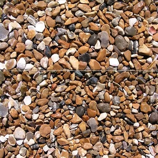
Maybe I've oversimplified the task using two similar pebble textures, but that only my first step. Magnetic lasso to cut the border, then clone stamping.
Thanks Prof,
You will still critique it if I, or anyone else, redoes it?
RM3
ps. is redoes a word?
RIP Calvin, you won't be forgotten.

Getting the blending and color/light correction was a little tough - I keep feeling I get too much of a blurred look to certain portions of it? Also, in retrospect, I used texture two for the top which was probably a bad idea - the bottom of this texture had light values much closer to texture one - doh! Ah well, done is done.

Last edited by Onosander; June 28, 2007 at 05:30 PM.
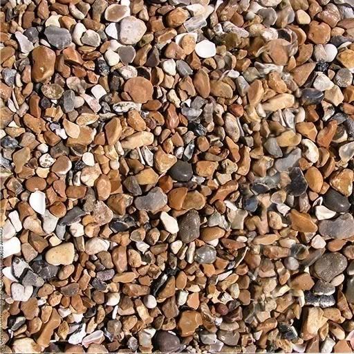
Here is another one, this time with pebbles:
http://www.cgtextures.com/getfile.ph...bles0011_L.jpg
http://www.cgtextures.com/getfile.ph...bles0014_L.jpg
Result:
http://i118.photobucket.com/albums/o...0014_Lcopy.jpg
Still, can't quite get rid of the blur... It's hard to make contrasting shadows if you sample all layers!!!
- Settlement coordinate locator -for RTW/M2TW
- EDB Validator v1.2.8 (Oct 16, 2012) - for RTW/M2TW
- RTW scripting tutorials
- n-turns per year script generator
Heres a couple more that I did, the first one, attempting to salvage my first result, I added some grass to it:
...though now it reminds of clay with grass stuck in it... however, I do find it rather nice:
Then I tried using the same grass, but with an existing hard earth pic:
This resulted in more of what I was originally looking for:
However, in this one, the grass and soil need to be much sharper to feel real, and its quite hard to do using the stamp tool, even with a hard edge... I found it to be more effective to copy and transfer parts of the texture, in order to keep it sharp... but you can still see I did some stamping. Anyways, grass and earth textures will probably have the smaller resolution to size ratio in games, hence these two would probably not be very useful unless I tiled them several times into one 512^2.
Last edited by drak10687; June 28, 2007 at 10:44 PM.
Chivalry - Total War I Settlement Plans and Buildings Dev...and Public Relations person, pm me with any specific questions concerning the mod...
Consilium Belli member
under the patronage of Sétanta
 Civis
Civis
BEFORE
AFTER
I regret using bricks
otark: I think that is actually the same pebble pile in both photos, just roughed up a bit. It makes your composite seem to much like it is tiled already; we want very minimal repetition in our texture space, or its wasted space.
Also, when you are working with very hard-edged stuff, its better not to clone so much, its better to copy pieces of an image, move them, then mask them away with a hardish eraser. I can clearly see the seam area on the right side, though the vertical seam is done well.
roman: yes, I will critique anything you post here, even if its not directly related to the coursework (though non-coursework, please make a new thread). But yeah, turn in as many assignments as you want.
Onosander: Great presentation, first of all. Only crit is the top-center color/value is off. An image adjustment to the area should fix it.
Ham: See otark's crit about hard-edged clones. It is hard to do things like mix two different types of pebbles, try something simpler until you are more experienced and know more techniques. Generally, if you needed a pebble tile, you'd have to get photos of the same area, or just use the same photo and tile it.
drak: I really like it, and it seems like it will make a very good normal map for the next lesson, since it has minimal lighting information. Only suggestion is, for the second texture, I would run some curves in order to darken the area around the grass that are too light (due to the original photo). You may also have to do some of this by hand.
Daio: Bricks are another hard one. The first thing you should have done, was resize one or the other so the bricks were the same size. The final image isn't really anything right now. Generally, bricks fall into the same category as pebbles: you would use the same texture or wall to make a 'master' tiling texture, then do different sorts of things to dirty and vary it. But combining different bricks as such into a master tile isn't very useful. I suggest you try another image so I can give better feedback.
Oli: Smart texture choice. Technically its pretty good, but I would have tried to 'melt' the two clouds into each other more, by maybe cloning some of the lower clouds on a new layer and setting them to "luminosity" blend mode, so they take on the upper sky's color, and the same with the top clouds in the lower sky. There's too hard a line between the two textures, in the sense that, its primarily horizontal (though your placement for the line is smart, where there is a strong horizontal band in the clouds of the lower image.
The major issue, though, is with the colors. I assume they are both sunsets (the colors are so vivid), but one is flipped? Generally dawn and dusk skies are a gradient, so you'd have orange on the horizon, blending into a purplish... your sky, though, has an orange in the middle, which is (on Earth) impossible. It could be some sort of alien sky or planet/ring texture, but it can't be used as a real sky, looks nice though. I would suggest trying to 'fix' this by using some creative blending modes and masks and coloring, in order to achieves a more linear gradient (as opposed to a "reflected" gradient you now have).
I'm REALLY glad to see the response to the assignment so far! It beats my expectations.
I only want to stress, its important to choose your textures appropriately... the starting images will make or break the final one, as much as your technical skills will. If you have any questions, PM or MSN me!

")
hi, sorry for being late...
Result

Under Patronage of MARCVS
so here i am with my little (not so cool like others) work with sand, hope not too late
before:
result:
i made one more to look more like sand to me, not like dusts
and one question to you Professor, when will be next assigment? becouse i will be not here for about a week, so just hope i will not be late
Last edited by gladiatort; June 30, 2007 at 03:20 AM.
 Posting Permissions